Widgets
A widget elevates key content from your app and displays it where people can see it at a glance on iPhone, iPad, and Mac. Useful and delightful, widgets can also help people personalize their iPhone Home screens in unique ways.
위젯은 앱의 주요 콘텐츠를 승격시켜 iPhone, iPad, Mac 사용자들이 한눈에 볼 수 있는 곳에 표시합니다. 실용적이고 즐거운 위젯은 사용자들이 직접 자신만의 방식으로 iPhone의 홈스크린에 개인화시킬 수도 있게 하죠.

In iOS 14, iPadOS 14, and macOS 11, widgets differ from the Today widgets available in earlier versions, offering a redesigned appearance and expanded capabilities. Widgets also use a different implementation framework;
iOS 14, iPadOS 14, macOS 11에서 위젯은 이전 버전에서 보여졌던 Today widget과는 다릅니다. 새롭게 디자인된 모습과 사용성을 높였죠. 또 위젯은 다른 구현 프레임워크를 사용합니다.
A Closer Look at Widgets
You can create widgets in small, medium, or large sizes. On iPhone, iPad, and Mac, people find widgets in the widget gallery, where they can also choose a widget’s size. After they choose a widget, people enter an edit mode where they can move the widget to their preferred location and in many cases, configure it. For example, people might choose to put multiple small Weather widgets on the Home screen so that they can configure each one to display the weather for a different location. People can place widgets on the Home screen or Today View on iPhone, the Today View on iPad, and in the macOS Notification Center.
On iPhone and iPad, the widget gallery also offers a prebuilt stack of widgets — called the Smart Stack — that people can place on their iPhone Home screen or Today View on iPhone or iPad. The Smart Stack contains a default set of widgets, including widgets from apps the user opens frequently. Over time, Siri can highlight specific widgets in the stack when they’re most likely to be relevant in the current context. When people enable Smart Rotate, Siri can also highlight relevant widgets within custom stacks that people create.
위젯은 소/중/대 사이즈로 만들어집니다. iPhone, iPad, Mac에서 사용자들은 위젯 갤러리를 통해 위젯을 찾을 수 있으며, 이 갤러리에서 위젯의 크기도 선택할 수 있습니다. 사용자들은 위젯을 선택한 뒤, 수정모드에 진입해 위젯의 위치를 원하는 곳으로 옮기고, 환경설정할 수 있습니다. 예를 들어, 사용자들은 여러개의 작은 날씨 위젯을 두어 서로 다른 지역의 날씨를 볼 수 있도록 설정할 수 있죠. iPhone의 홈화면이나 Today view, iPad의 Today view, Mac의 알림센터에 위젯을 둘 수 있습니다.
iPhone과 iPad에서 위젯 갤러리는 '스마트 스택'이라고 불리는 미리 지어진 위젯 기능을 제공합니다. 이 스마트 스택은 iPhone, iPad의 홈화면이나 Today view에 둘 수 있습니다. 스마트스택은 위젯의 기본 설정을 포함하며, 사용자들이 자주 여는 앱의 위젯도 들어있습니다. 오랜시간에 걸쳐, 시리는 현재 상황과 가장 관련있고 적합한 특정 위젯을 강조할 수 있는 기능을 갖게 되었습니다. 사용자들이 Smart Rotate를 활성화시키면, 시리는 사용자들이 만들어낸 커스텀 스택 위젯들을 강조할 수 있습니다.
NOTE
Today widgets designed for iOS 13 and earlier aren’t available on the Home screen, but remain accessible at the bottom of the Today View and in the macOS Notification Center.
iOS 13 이전에 만들어진 위젯은 홈스크린에서 사용할 순 없지만, Today view 또는 Mac의 알림센터 아래쪽에서 사용할 수 있습니다.
Creating a Useful, Focused Widget
Although people can tap a widget to see or do more in your app, a widget’s main purpose is to display a small amount of timely, personally relevant information that people can view without opening your app. Identifying a single idea for a widget and scoping the information to display are crucial first steps in the design process.
사용자들이 당신의 앱을 보고 뭔가를 더 하기 위해선 위젯을 탭해야하긴 하지만, 위젯의 주된 목적은 시간에 맞춰진, 개인화된 관련 정보를 앱을 열지 않고도 보여주는데 있습니다. 위젯을 위한 작은 아이디어를 만들고, 정보를 샅샅이 살피는 것은 디자인 프로세스의 중요한 첫번째 발걸음이죠.
Focus your widget on one idea. Widgets are glanceable because they display only a small amount of information, so it generally works best to choose a simple idea that’s clearly related to your app’s main purpose. In some cases, this might mean choosing an idea that resembles the app’s main purpose — for example, a weather app’s widget could show the weather for a single location or the widget for a calorie-tracking app might show calories burned for the day. In other cases, a widget’s idea can reflect an aspect of the app’s main purpose — for example, a game’s widget could show a character’s status or a drawing app’s widget might display favorite sketches.
위젯을 위한 '한개의' 아이디어에 집중하세요. 위젯은 적은 양의 정보만 보여주기 때문에 한눈에 쉽게 알아볼 수 있습니다. 즉 앱의 주목적과 잘 연결된 한가지의 간단한 아이디어를 선택하는 것이 중요합니다. 몇몇의 경우 위젯은 앱의 주목적을 나타내는 것이라고 설명할 수 있습니다. 예를 들어, 날씨 앱의 위젯은 한 지역의 날씨를 알려줘야 할 것이며, 칼로리 추적 앱은 오늘 하루동안 소모한 칼로리양을 보여줘야 할 것입니다. 또 다른 경우엔 위젯의 아이디어가 앱의 주목적의 측면을 반영할 수 있습니다. 예를 들어, 게임 위젯은 캐릭터의 상태를 보여주거나, 그림 그리기 앱의 위젯은 좋아하는 스케치를 보여줄 수 있죠.
(오역이 있는 것 같아 추후에 다시 한번 보기로..)

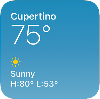
In each size, display only the information that’s directly related to the widget’s idea. In larger widgets, you can display more data — or more detailed visualizations of the data — but it’s crucial to stay focused on the widget’s idea. For example, the small Weather widget shows only the current temperature and weather conditions, and the day’s high and low temperature values for a location. The medium Weather widget shows the same data and adds a six-hour forecast. The large Weather widget also shows the same data, including the six-hour forecast, and adds the forecast for the next five days.
각각의 사이즈별로 위젯의 아이디어와 관련된 정보를 보여주세요. 큰 사이즈의 위젯에선 더 많은 정보, 혹은 더 자세한 시각정보를 보여줄 수 있습니다. 그러나 위젯의 아이디어에 집중하는 것이 중요합니다. 예를 들어 날씨 위젯 작은 사이즈는 현재 온도와 날씨 상태, 그날의 최고 및 최저온도만을 보여줄 수 있을 것입니다. 중간 사이즈에서는 같은 데이터에 6시간 동안의 예보를 더해 보여줄 수 있습니다. 마지막으로 가장 큰 위젯 사이즈의 경우, 앞서 말한 모든 정보에 5일간의 날씨예보 정보 또한 더해 보여줄 수 있겠죠.


Avoid creating a widget that does nothing but launch your app. People appreciate widgets because they provide instant access to meaningful content. A widget that behaves like an app icon offers no additional value and isn’t likely to remain on the user’s screen.
아무 기능도 하지 않으면서 앱 시작만을 지원하는 위젯은 만들지 마세요. 사용자들은 위젯이 빠르게 접근할 수 있는 의미있는 컨텐츠를 제공하기 때문에 사용합니다. 그저 앱아이콘 마냥 추가 정보나 가치 없이 작동하는 위젯은 사용자들의 화면에 남아있을 리 없겠죠.
Offer your widget in multiple sizes when doing so adds value. In general, avoid simply expanding a smaller widget’s content to fill a larger area. It’s more important to create one widget in the size that works best for the content you want to display than it is to provide the widget in all sizes.
위젯을 다양한 크기로 지원해 정보를 더 많이 볼 수 있도록 하세요. 작은 위젯의 내용을 단순히 넓은 영역에 늘려 배치하지 마세요. 각각의 영역 크기에 맞는 적절한 콘텐츠를 만드는 것이 중요합니다.
Prefer dynamic information that changes throughout the day. If a widget’s content never appears to change, people may not keep it in a prominent position. Although widgets don’t update from minute to minute, it’s important to find ways to keep their content fresh to invite frequent viewing.
하루종일 계속해서 바뀌는 정보를 보여주는 것이 더 좋습니다. 만약 위젯의 내용이 절대 바뀌지 않는다면, 사용자들은 그 위젯을 중요한 위치에 계속 두지 않을 것입니다. 위젯이 매 분마다 계속 바뀌지 않더라도, 신선한 콘텐츠를 유지하며 사용자의 참여를 이끌어내는 것이 중요합니다.
Look for opportunities to surprise and delight. For example, you might design a unique visual treatment for your calendar widget to display on meaningful occasions, like birthdays or holidays.
놀라움과 즐거움을 줄 기회를 찾아보세요. 예를 들어, 달력 앱에서 생일이나 기념일같은 의미있는 일을 보여주기 위해 특이한 시각 자료를 디자인할 수 있습니다.

Supporting Widget Configuration and Interactivity
Offer a configurable widget when it makes sense. In many cases, people need to specify the information they want to see before a widget can display useful content. For example, people need to choose a location for a Weather widget or a stock symbol for a Stocks symbol widget. In contrast, the Podcasts widget is preconfigured to display recent content, so people don’t need to customize it. If you’re creating a configurable widget, avoid requiring too many settings or asking for information that might be hard for people to find. You don’t have to design a configuration UI for your widget, because the system automatically generates it for you.
타당하다면 설정변경 가능한 위젯을 제공하세요. 많은 경우, 위젯에서 가치있는 내용을 보여주기 전에 사용자들이 보고싶은 정보들을 구체화할 필요가 있습니다. 예를 들어, 날씨앱의 사용자들은 지역을 설정해야하고, 주식앱의 사용자들은 주식 종목명의 약칭(예_ 맥도날드의 약칭은 MCD, 존슨앤존슨의 약칭은 JNJ)을 설정해야하죠. 반대로, 팟캐스트 위젯은 가장 최근에 들은 콘텐츠를 미리 보여주어 사용자들이 커스텀할 필요 없게 만들죠. 만약 설정을 변경할 수 있는 위젯을 만든다면, 너무 많은 설정을 요구하거나 사용자들이 찾기 어려울 정보를 묻지 마세요. 위젯의 배치 UI를 디자인할 필요는 없습니다. 시스템에서 자동으로 생성하니까요.
Ensure that tapping your widget opens your app at the right location. When people tap your widget, it deep-links into your app, where you can offer details and actions that are directly related to the widget’s content. For example, when people tap a Stocks symbol widget, the Stocks app opens to a page that displays information about that symbol. Similarly, when people tap a small Stocks watchlist widget, the app opens to show the complete watchlist.
위젯을 탭하면 앱의 올바른 지점으로 가게 하세요. 위젯을 탭하는 것은 앱을 딥 링크(앱의 특정 페이지로 연결하는 링크) 하는 것이고, 이 링크에서 당신은 위젯의 내용과 관련된 세부사항과 액션을 제공해야 합니다. 예를 들어 사용자들이 주식 종목명의 약칭을 누르면, 주식 앱은 그 종목명과 관련된 내요을 보여줘야 합니다. 비슷한 예로 작은 사이즈의 주식 종목표 위젯을 누르면, 완전한 종목표를 보여주는 앱이 열려야 하죠.
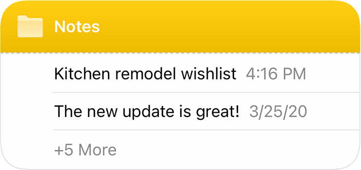
Avoid defining too many tap targets. A small widget supports a single tap target, but medium and large widgets can offer multiple targets. For example, the medium Notes widget can display several notes. When people tap one of them, the app opens to display that note.
위젯 탭 목표를 너무 여러개 만들지 마세요. 작은 사이즈의 위젯은 단일한 탭 타겟(목표)을 지원하지만, 중간, 큰 사이즈의 위젯은 여러개의 타겟을 제공할 수 있습니다. 예를 들어, 중간 사이즈의 메모 앱은 여러개의 메모를 보여줄 수 있습니다. 만약 사용자들이 그 중 하나를 누르면, 메모 앱에선 그 메모를 열어 보여줍니다.
Although multiple tap targets might make sense for your content, avoid offering so many targets that people have trouble tapping the one they want.
여러개의 탭 타겟을 만드는게 당신의 앱에서 타당하더라도, 너무 많은 타겟을 만들어 그들이 원하는 부분 영역을 탭하기 어렵게 만들어서는 안됩니다.
Let people know when authentication adds value. If your widget provides additional functionality when someone is logged in to your app, make sure people know that. For example, an app that shows upcoming reservations might include a message like “Sign in to view reservations” when people aren’t logged in.
앱을 허가(인증) 해서 더 큰 가치를 더할 수 있다면 사용자들에게 알려주세요. 만약 앱에 로그인하면 위젯이 추가로 더 많은 기능을 제공한다면, 사용자들이 이를 알게 하세요. 예를 들어, 다가오는 예약을 보여주는 앱은 아직 로그인하지 않은 사용자들에게 "로그인하여 예약내역 보기"와 같은 메세지를 포함하여 보여줄 수 있습니다.
Updating Widget Content
Keep your widget up-to-date. To remain relevant and useful, widgets should periodically refresh their information. Widgets don’t support continuous, real-time updates, and the system may adjust the limits for updates depending on various factors. Finding the right update frequency for your widget depends on knowing how often the data changes and estimating how often people need to see new data. For example, a widget that helps people track a beach’s tides could provide useful information on an hourly basis, even though tide conditions change constantly. If people are likely to check your widget more frequently than you can update it, consider displaying text that describes when the data was last updated.
위젯은 항상 최신으로 유지하세요. 삶에 유의미하고 쓸모있는 위젯이 되려면, 주기적으로 정보를 업데이트 해야 합니다. 위젯은 연속적 업데이트나 실시간 업데이트를 지원하지 않으며, 시스템에서 여러 요인을 고려해 업데이트 한도를 조정할 수도 있습니다. 위젯에 적절한 업데이트 주기를 찾기 위해선 데이터가 얼마나 자주 바뀌는지 알고, 사용자들이 새 데이터를 얼마나 자주 봐야하는지 추정할 수 있어야 합니다. 예를 들어, 해안가의 밀물과 썰물을 추적하는 위젯은 의미있는 정보를 시간 단위로 제공할 수 있습니다. 밀물과 썰물의 조건이 지속적으로 변하더라도요. 만약 사용자들이 당신이 업데이트하는 것 보다 더 자주 위젯을 확인한다면, 데이터가 언제 업데이트 되었는지 보여주는 것을 고려할 수 있습니다.
Let the system update dates and times in your widget. Widget update frequency is limited, and you can preserve some of your update opportunities by letting the system refresh date and time information.
시스템에서 위젯의 날짜와 시간이 업데이트 되도록 하세요. 위젯의 업데이트 주기는 제한되어 있으니, 시스템이 날짜와 시간 정보를 새로고침하게 둠으로서 몇몇 업데이트 기회를 보존할 수 있을 것입니다.
Show content quickly. When you determine the update frequency that fits with the data you display, you shouldn’t need to hide stale data behind placeholder content.
내용을 빠르게 보여주세요. 보여주는 정보에 맞는 업데이트 주기를 결정할 때, 오래된 데이터를 플레이스 홀더 내용 뒤에 숨길 필요 없습니다.
Designing a Beautiful Widget
In iOS 14 and later, widgets use rich, bold colors, evocative images, and clear, crisp text that’s easy to read at a glance. A unique, beautiful widget not only provides useful information, it also gives people an opportunity to personalize the Home screen.
iOS 버전 14 이후, 위젯은 풍부하고 대담한 색상, 강렬한 이미지, 한눈에 읽기 쉬운 명확하고 선명한 텍스트를 사용합니다. 독특하고 아름다운 위젯은 유용한 저오를 제공할 뿐만 아니라, 사용자들이 홈스크린을 개인화시킬 수 있는 기회를 주죠.
Help people recognize your widget by including design elements linked to your brand’s identity. Design elements like brand colors, typeface, and stylized icons are great for making a widget instantly recognizable, but they can be easy to overuse. Take care to keep brand-related design elements from crowding out useful information or making your widget look out of place on the Home screen or Today View.
브랜드 아이덴티티와 연결되는 디자인 요소를 넣어 다른 위젯과 구분되게 하세요. 브랜드 색상, 서체, 디자인된 아이콘과 같은 디자인 요소는 위젯을 즉시 인지할 수 있게 해주지만, 남용될 수 있습니다. 브랜드 관련 디자인 요소를 너무 많이 써 유용한 정보를 몰아내거나, 홈스크린 또는 Today view에서 동떨어져 보이게 하지 않도록 주의하세요.
Avoid displaying a logo, wordmark, or app icon in your widget. The exception to this is when your widget displays curated content from multiple sources. In this case, a small logo in the upper-right corner of the widget subtly reminds people that your app is delivering the content. It can also be helpful to display a small logo or wordmark to attribute the source of the content your widget displays.
로고, 문자상표*, 앱아이콘을 위젯에 넣지 마세요. 위젯이 다양한 출처에서 큐레이팅한 콘텐츠를 보여주는 경우만이 예외입니다. 이런 경우, 우상단의 작은 로고를 넣어 현재 위젯이 콘텐츠를 제공중이라는 것을 인지시킬 수 있습니다. 작은 로고나 워드마크를 넣어 위젯에서 보여주는 콘텐츠의 출처를 인용할 수도 있을 것입니다.

Aim for a comfortable density of information. When content appears sparse, the widget can seem unnecessary; when content is too dense, the widget isn’t glanceable. If you have lots of information to include, avoid letting your widget become a collage of items that are difficult to parse. Seek ways to curate the content so that people can grasp the essential parts instantly, and view relevant details at a longer look. You might also consider creating a larger widget and looking for places where you can replace text with graphics without losing clarity.
정보의 적절한 밀도를 유지하세요. 콘텐츠의 밀도가 희박한 경우, 위젯은 불필요한 것으로 여겨집니다. 반면, 콘텐츠가 너무 빽빽히 있을 땐 위젯을 한눈에 알아보기 어렵죠. 만약 포함할 정보가 많다고 해도, 위젯이 분석하기도 어려운 아이템들의 콜라주가 되선 안됩니다. 콘텐츠를 큐레이션 할 수 있는 방법을 찾아 사용자들이 중요한 부분을 즉시 파악할 수 있도록 하고, 상세정보는 좀 더 오랫동안 보고 알아차릴 수 있오록 하세요. (강약을 조절하라는 뜻으로 이해함) 위젯을 큰사이즈로 만들어 텍스트와 그래픽을 명확하게 유지하며 적절히 배치하는 것을 고려할 수도 있습니다.
Use color judiciously. Rich, beautiful colors draw the eye, but they should never prevent people from absorbing a widget’s information at a glance. Use colors to enhance a widget’s appearance without competing with its content. In your asset catalog, you can also specify the colors you want the system to use as it generates your widget’s configuration UI.
색상은 신중하게 사용하세요. 풍부하고 아름다운 색상은 눈길을 끌지만, 절대 사용자들이 한눈에 정보를 받아들이지 못하게 해서는 안됩니다. 색을 사용하면 콘텐츠로만 경쟁할 필요 없이 위젯의 모습을 더 아름답게 할 수 있습니다. 에셋 카탈로그에 원하는 색을 지정하면 시스템이 배치 UI를 만들때 자동으로 사용하게 할 수 있습니다.
Support Dark Mode. A widget should look great in both the light and dark appearances. In general, avoid displaying dark text on a light background for the dark appearance, or light text on a dark background for the light appearance. When you use the semantic system colors for text and backgrounds, the colors dynamically adapt to the current appearance. You can also support different appearances by putting color variants in your asset catalog. For guidance, see Dark Mode (iOS) and Dark Mode (macOS); for developer guidance, see About Asset Catalogs.
다크모드를 지원하세요. 위젯은 라이트모드/ 다크모드 상관없이 멋져보여야 합니다. 일반적인 경우라면 다크모드에서 어두운 텍스트+밝은 배경을 보여주거나, 라이트모드에서 밝은 텍스트+어두운 배경을 보여주지 마세요. 텍스트와 배경을 위한 '의미를 가진 색'* 시스템을 사용하면, 현재 모드가 무엇인지에 따라 바로 적용 가능합니다. 에셋 카탈로그에 다른 색상 변형값을 두어 다른 모습을 지원할 수도 있습니다.


참고_
'의미를 가진 색(semantic system color)' : 라벨, 경고, 통화 등 특정 의미를 나타내는 색들.
시맨틱 컬러와 다크모드 관련 아티클
labs.brandi.co.kr/2019/12/19/kimjh.html
iOS 13에서 다크모드 적용하기
Overview
labs.brandi.co.kr
Consider using SF Pro. Using the system font helps your widget look at home on any platform, and makes it easy to display great-looking text in a variety of weights, styles, and sizes. If you need to use a custom font, consider using it sparingly and be sure it’s easy to read at a glance. It often works well to use a custom font for the large text in a widget and use SF Pro for the smaller text. For guidance, see Typography (iOS) and Typography (macOS).
SF Pro 사용을 고려해보세요. 시스템 폰트를 사용하면 어떤 플랫폼에서도 위젯이 동떨어져 보이지 않고, 다양한 굵기, 스타일, 사이즈에 관계없이 멋져보이게 할 수 있습니다. 만약 커스텀된 서체를 사용해야 한다면, 조금만 사용하고 한눈에도 읽기 쉽도록 하세요. 위젯에서 커스텀 서체를 큰 사이즈의 텍스트에, 작은 사이즈의 텍스트는 SF Pro를 사용하면 잘 어우러질 수 있습니다. 가이드는 Typography (iOS), Typography (macOS) 에서 확인하세요.
Always use text elements in a widget to ensure that your text scales well. In particular, don’t rasterize text — doing so prevents VoiceOver from speaking your content.
위젯에선 항상 적절한 사이즈의 텍스트를 사용해야합니다. 특히, 텍스터를 래스터라이징 하지 마세요. 래스터라이징 하면 콘텐츠를 읽어주는 VoiceOver 기능을 사용할 수 없게 됩니다.
Consider using SF Symbols. SF Symbols helps you align and scale symbols with text that uses SF Pro. For guidance, see SF Symbols.
SF 심볼 사용을 고려해보세요. SF 심볼을 사용하면 SF Pro 서체의 텍스트와 심볼을 정렬하고, 심볼의 크기를 정하는데 도움이 됩니다. 가이드는 SF Symbols 에서 확인하세요.
Design a realistic preview to display in the widget gallery. Highlighting your widget’s appearance and capabilities helps people make an informed decision and can encourage them to add your widget. You can display real data in your widget preview, but if the data takes too long to generate or load, display realistic simulated data instead.
위젯 갤러리엔 실제로 사용되는 것 같은 위젯 미리보기를 디자인하세요. 위젯의 모습과 기능을 강조하면, 사용자들이 정보를 바탕으로 의사결정하는 것을 돕고 당신의 위젯을 (홈화면에) 추가할 가능성을 높입니다. 위젯 미리보기에 실제 데이터를 보여줄 수 있습니다. 그러나 정보를 보여주거나 불러오는데 너무 오래 걸리면, 최대한 실제와 비슷한 데이터를 대신 보여주세요.
Design placeholder content that helps people recognize your widget. A widget displays placeholder content while its data loads. You can create an effective preview by combining static parts of the UI with semi-opaque shapes that stand in for actual content. For example, you can use rectangles of different widths to suggest lines of text, and circles or squares in place of glyphs and images.
플레이스홀더 콘텐츠*는 사용자가 당신의 위젯인지 인지할 수 있도록 디자인되어야 합니다. 위젯은 데이터를 불러오는 동안 플레이스홀더 콘텐츠를 보여줍니다. 실제 콘텐츠를 대신하는 고정된 반투명 UI 요소들을 조합해 효과적인 미리보기를 만들 수 있습니다. 예를 들어, 여러 넓이의 직사각형들을 사용해 텍스트 열을 보여준다던지, 동그라미나 네모로 문자, 이미지의 위치를 대신할 수 있죠.


Avoid mirroring your widget’s appearance within your app. People know that tapping a widget or other Home screen element opens a view within an app. If your app displays an element that looks like your widget but doesn’t behave like it, people can be confused when the element responds differently to their tap. Also, people may be less likely to try other ways to interact with such an element in your app, because they expect it to behave like a widget.
위젯을 앱의 한 요소와 똑같게 만들지 마세요. 사용자들은 위젯이나 다른 홈스크린 요소를 누르면 앱의 화면이 나온다는 것을 압니다. 위젯처럼 생겼는데도 위젯의 기능을 하지 않는 요소를 보여준다면, 사용자들은 이를 탭했을 때 예상과 다른 반응에 혼란스러워 할 것입니다. 그 뒤엔 위젯의 기능을 기대하며 앱의 다른 요소와 상호작용하려 하진 않을 것입니다.
Write a succinct description of your widget. The widget gallery displays descriptions that can help people understand what each widget does. It generally works well to begin a description with an action verb; for example, "See the current weather conditions and forecast for a location" or "Keep track of your upcoming events and meetings." Avoid including unnecessary phrases that reference the widget itself, like "This widget shows...," "Use this widget to...," or "Add this widget." Use approachable language and sentence-style capitalization.
위젯에 대한 간결한 설명을 적으세요. 사용자들이 위젯의 기능을 이해할 수 있도록, 위젯 갤러리에선 각 위젯의 설명을 보여줍니다. 설명은 동사로 시작하는 것이 좋습니다(하지만 한국어는 아님). 예를 들어, "설정한 지역의 현재 날씨 상태와 예보 보기" 나 "다가오는 이벤트나 일정 소식 받아보기" 등이 있습니다. 위젯 자체를 설명하는 "이 위젯은 ~", "이 위젯을 사용해 ~ 하세요.", "이 위젯을 추가하세요"와 같은 요소는 필요 없습니다. 적절한 언어와 문장으로 마무리되는 텍스트를 사용하세요.
Adapting to Different Screen Sizes
Widgets scale to adapt to the screen sizes of different devices and onscreen areas. Ensure that your widget looks great on every device by supplying content at appropriate sizes.
위젯은 각기 다른 기기와 스크린 영역에 맞도록 크기가 조절됩니다. 적절한 사이즈에 맞는 콘텐츠를 제공하여 어떤 기기에서든지 멋져보이는 위젯을 만들도록 하세요.
Size images to look great on large devices and at high scale factors. On small devices and at low scale factors, images may resize to fit smaller dimensions. For example, to make sure that a small widget’s background image looks great on large devices, create an image that measures 169x169 pt (507x507 px @3x). When this widget runs on a device with a screen size of 320x568 pt, SwiftUI resizes the image to look good at 141x141 pt. As you create images for various devices and scale factors, use the sizes listed below for guidance.
크기가 큰 기기나 고해상도에서도 여전히 이미지가 좋아보이도록 사이즈를 조절하세요. 크기가 작은 기기나 낮은 해상도에선 이미지가 작은 디멘션에 대응하기 위해 작아질 수 있습니다. 예를 들어, 작은 버전의 위젯 배경 이미지가 큰 기기에서도 잘 보일 수 있도록 169*169 pt의 이미지를 만드세요. 위젯이 화면 크기가 320*568 pt인 기기에서 사용되면, SwiftUI에서 이미지가 141*141 pt에서도 잘 보일 수 있도록 조정합니다. 다양한 기기와 해상도를 위해 이미지를 만든다면, 아래 가이드라인을 참고하세요.
| Screen size (portrait) |
Small widget | Medium Widget | Large widget |
| 414x896 pt | 169x169 pt | 360x169 pt | 360x376 pt |
| 375x812 pt | 155x155 pt | 329x155 pt | 329x345 pt |
| 414x736 pt | 159x159 pt | 348x159 pt | 348x357 pt |
| 375x667 pt | 148x148 pt | 322x148 pt | 322x324 pt |
| 320x568 pt | 141x141 pt | 291x141 pt | 291x299 pt |
*스크린 사이즈와 소/중/대 버전에 따른 위젯의 사이즈
Coordinate the corner radius of your content with the corner radius of the widget. To ensure that your content looks good within a widget’s rounded corners, use a SwiftUI container to apply the correct corner radius. For developer guidance, see ContainerRelativeShape.
위젯의 둥근 모서리와 콘텐츠의 둥근 모서리를 서로 잘 조정하세요. 위젯의 둥근 모서리와 잘 어울릴 수 있도록 SwiftUI 콘테이너를 사용해 둥근 정도를 조정하세요.
Ensure text and glyphs adapt to size changes. Consider using SF Pro and SF Symbols to help your text and glyphs look great and remain aligned at every size.
위젯의 사이즈가 변할 때 텍스트와 글리프의 사이즈도 잘 맞춰 변경되는지 확인하세요. SF Pro와 SF 심볼 사용을 고려해볼 수 있습니다. 사용 시 어떤 사이즈에서도 좋아보이고 정렬이 흐트러지지 않습니다.
NOTE
In iOS, widgets support Dynamic Type sizes from Large to xxxLarge when you use Font to choose a system font or custom(_:size:) to choose a custom font.
시스템 폰트를 사용하거나, custom(_:size:) 하여 커스텀 폰트를 사용하는 경우 iOS에서 위젯은 Large부터 xxxLarge 사이즈까지 지원합니다.
In general, use standard margins to ensure your content is comfortably legible. The standard margin width is 16 points. If your widget displays content like text, glyphs, and graphs, use the standard margins to avoid crowding the edges and creating a cluttered appearance. If you use background shapes to create visual content groupings, or if you display button backgrounds, you might need to use tight margins. Tight margins — which measure 8 points in width — can also help make graphics that contain information easier for people to read.
일반적인 정도의 마진을 사용해 또렷한 콘텐츠를 유지하세요. 표준 마진은 16 points 입니다. 위젯이 텍스트, 글리프, 그래프같은 콘텐츠를 보여준다면 표준 바진을 사용해 가장자리에 충분한 여유를 확보하며 어수선해지지 않도록 하세요. 만약 시각 콘텐츠들을 그룹으로 붂기 위해 배경에 모양을 사용하거나, 배경에 버튼을 사용한다면 짧은 마진을 사용해야 할 수도 있습니다. 8 points인 짧은 마진은 사용자들이 정보가 포함된 그래픽을 읽기 쉽도록 합니다.
네번째 카테고리인 System Capabilities도 이제 위젯으로 끝! 다음 포스팅부턴 Visual Design이 시작된다.


