In iOS 14 and later, a button can display a pull-down menu that lists items or actions from which people can choose. You can use a pull-down menu — or simply menu — to offer items that are directly related to the button's action or to provide a list of actions that are useful in the current context.
Menus offer several advantages over action sheets, context menus, and popovers. For example:
- A menu opens very near the button that reveals it, so people can instantly understand the relationship between the menu's items and the action they're performing.
- In addition to listing actions, a menu can offer selections people can use to affect the primary action.
- Menus animate quickly into view and don't dim the screen when they appear, giving both the transition and the overall experience a lightweight feel.
iOS 14 포함 이후버전에선 버튼이 풀다운 메뉴를 표시해 사용자들이 선택할 수 있는 아이템이나 액션 리스트를 보여줄 수 있습니다. 또 풀다운 메뉴(이하 메뉴)를 사용해 버튼의 액션에 직접 관련된 아이템을 제공하거나, 현재 맥락에서 유용한 액션 리스트를 제공할 수도 있습니다.
메뉴는 액션 시트, 컨텍스트 메뉴, 팝오버에서 여러 이점이 있는데, 예를 들면:
- 메뉴는 버튼의 매우 근처에서 열리므로, 사용자들은 즉시 메뉴의 아이템과 수행하는 액션 간의 관계를 이해할 수 있습니다.
- 액션 리스트를 보여주는 것 외에도, 주요 액션에 영향을 줄 수 있는 선택지를 제공할 수 있습니다.
- 메뉴는 빠른 애니메이션으로 작동하고 나타날 때 화면을 어둡게 하지 않기 때문에, 전환을 포함한 전반적인 경험을 너무 무겁게 하지 않습니다.
For developer guidance, see UIMenu.
Don't put every action in a menu. Menus let you offer a range of items without cluttering your interface, but putting every action in a menu means that people have to tap at least twice to do anything. Continue to put the most important actions in your main interface and use menus to offer supplementary items. For example, composing a new message is the most common action people take in Messages, so the Compose button is prominently featured in the main interface. To give people a convenient set of editing options, Messages attaches a menu to the Edit button instead of displaying the options in the main interface.
메뉴에 모든 액션을 넣진 마세요. 메뉴는 화면을 어지럽히지 않으면서 몇 아이템을 제시할 수 있도록 합니다. 메뉴에 모든 액션을 다 넣으면, 오히려 어떤 액션을 위해 사용자가 최소한 두번 이상 탭하게 만듭니다. 화면엔 가장 중요한 액션을 넣고, 메뉴에는 보조적인 아이템을 넣도록 하세요. 예를 들어 새 메세지 작성은 메세지 앱에서 사용자들이 가장 많이 사용하는 기능이므로, 작성 버튼은 메인 인터페이스 안에 눈에 띄게 위치해야 합니다. 사용자들에게 편리한 수정 옵션을 제공하기 위해, 메세지 앱에서는 수정 옵션들을 화면에 다 늘어놓는 대신 수정 버튼에 (풀다운) 메뉴를 사용합니다.
Use a menu to present options that are directly related to an action. A menu lets you give people a way to clarify an action's target or customize its behavior without adding buttons to the main interface. For example:
- When people tap an Add button in your app, you could present a menu that lets them specify the item they want to add.
- If your app supports sorting, you could use a menu to let people select an attribute on which to sort.
- In an app that enables navigation among multiple locations, a menu can let people navigate to a specific location instead of retracing each step.
메뉴엔 액션과 직접 관련이 있는 옵션만 보여주세요. 메뉴를 사용하면 액션의 목적을 명확하게 하거나, 화면에 버튼을 추가하지 않고도 기능을 추가(커스텀)할 수 있습니다. 예를 들어:
- 앱에서 추가 버튼을 탭하면, 추가하고싶은 아이템을 지정하는 메뉴를 보여줄 수 있습니다.
- 앱이 정렬 기능을 지원한다면, 어떤 기준으로 정렬할지 메뉴를 보여줄 수 있습니다.
- 앱이 여러 위치에서 탐색하기를 지원한다면, 메뉴를 사용해 단계를 되밟지 않고도 특정 위치로 움직일 수 있습니다.
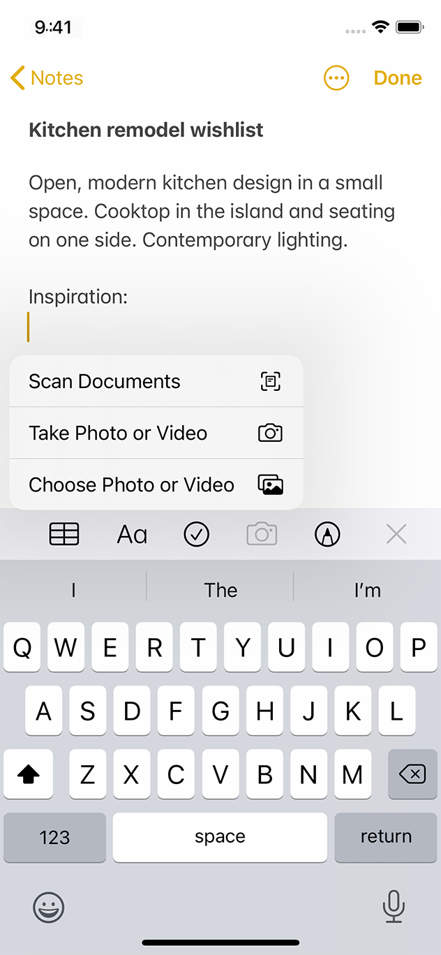
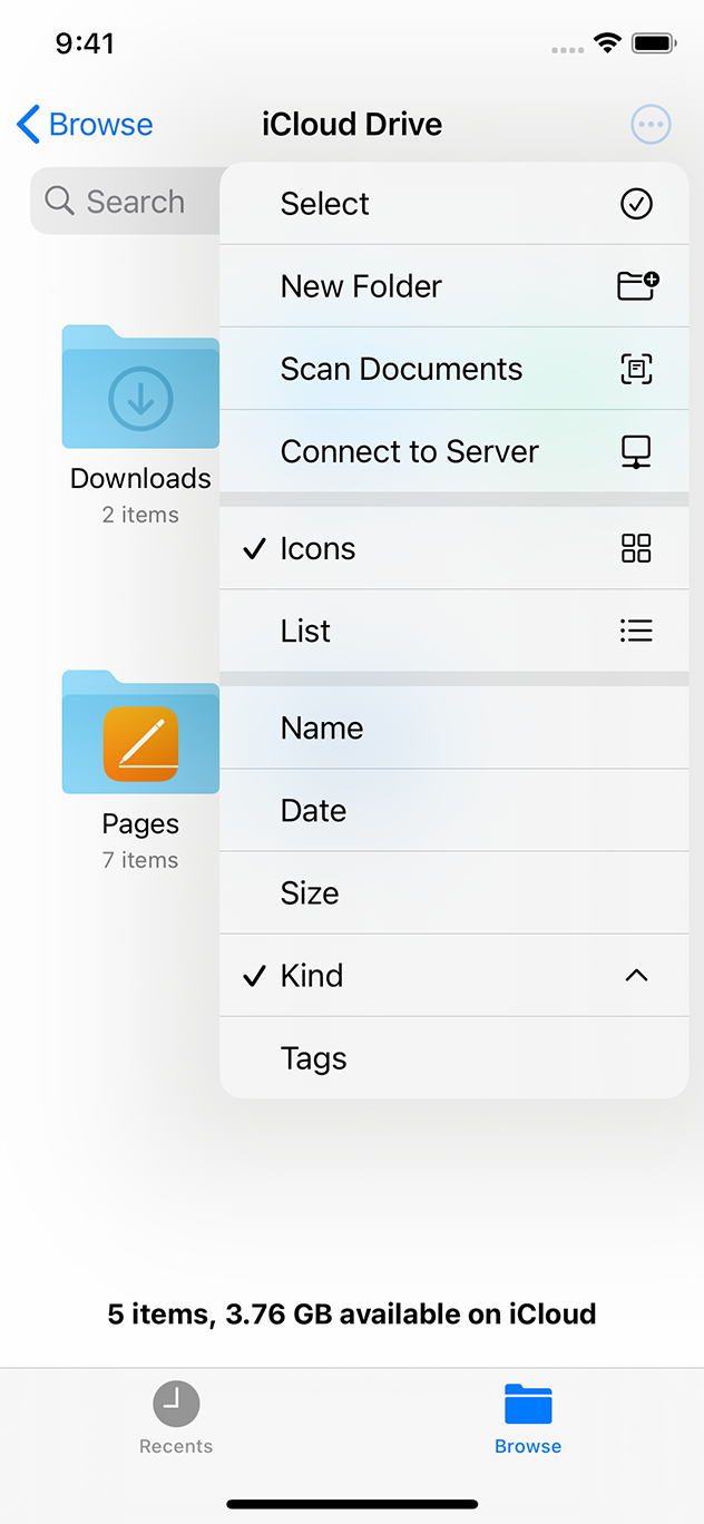
Use a menu to provide secondary app actions. If your app includes essential actions that don't belong in the main interface, you can group these actions in a menu. For example, Files uses a menu to provide actions — like adding a folder or scanning a document — in addition to options for viewing and sorting the content.
이차적인 앱 액션을 위해 메뉴를 사용하세요. 주 화면에는 없는 주요한 액션들이 있다면, 이 액션들을 메뉴에 그룹지을 수 있습니다. 예를 들어 파일 앱은 폴더 추가하기, 문서 스캔하기 같은 액션을 위해 메뉴를 사용합니다. 콘텐츠 정렬 방식을 위해서도 메뉴를 사용합니다.
Consider adding a More button to display a menu. A More button integrates well with most interfaces, and people generally understand that it provides access to additional functionality. You can create a More button by placing the ellipsis symbol within a circular button (see SF Symbols to learn more about symbols). Alternatively, you can let people reveal a menu by performing a specific gesture on an existing button. For example, in iOS 14 and later, Safari responds to a touch and hold gesture on the tabs button by displaying a menu of tab-related actions like New Tab and Close All Tabs.
메뉴를 표시하기 위해 '더보기'버튼을 넣어보세요. '더보기' 버튼은 대부분의 화면과 잘 어울리며, 사용자들은 이가 추가 동작을 제공한다는 것을 이해합니다. 더보기 버튼은 원 버튼 안에 ... 심볼을 위치시켜 만들 수 있습니다. 혹은, 존재하는 버튼에 특정 제스처를 작동시켜 메뉴를 보여줄 수도 있습니다. 예를 들어 iOS 14 포함 이후 버전에선 사파리의 탭 버튼을 터치 후 유지하면 새 탭, 모든 탭 닫기 같은 탭 관련 액션 메뉴를 보여줍니다.
Use separators to visually group related menu items. Creating visual groupings can help people scan a menu more quickly. For example, the More menu in the Files app uses separators to help people distinguish actions that affect the content from items related to viewing and sorting. Using more than about three groups in a menu can make it seem difficult to parse.
구분선을 넣어 메뉴 아이템 그룹을 지으세요. 시각적 그룹을 만들면 사용자들이 메뉴를 더 빠르게 인식할 수 있게 합니다. 예를 들어, 파일 앱의 더보기 메뉴는 구분선을 사용하고, 이는 사용자들이 보기, 정렬하기와 같이 콘텐츠에 영향을 주는 액션임을 구분하는데 도움을 줍니다. 하지만 메뉴에 네개 이상의 그룹을 사용하면 분석하기 어려워 보일 수 있습니다.
Let people know when a menu item is destructive, and ask them to confirm their intent. Menus use red text to highlight actions that you identify as potentially destructive. When people choose a destructive action, the system displays an action sheet (iOS) or popover (iPadOS) in which they can confirm their choice or cancel the action. Because an action sheet appears in a different location from the menu and requires deliberate dismissal, it can help people avoid losing data by mistake.
메뉴의 아이템이 파괴적임을 알게 하고, 의도를 한번 더 확인하세요. 메뉴에선 파괴적 액션을 강조하기 위해 빨간색 텍스트를 사용합니다. 이러한 액션을 선택하면, 시스템은 액션시트(iOS)나 팝오버(iPadOS)를 띄워 그 선택을 확정하거나 취소할 수 있게 합니다. 액션 시트는 메뉴와 다른 위치에서 나타나고, 신중한 선택을 요구하기 때문에 의도치 않게 데이터를 잃는것을 방지합니다.
Include a glyph with a menu item when it provides value. If you need to clarify an item's meaning, you can display a glyph or image after its title. Using an SF symbol for this purpose can help you provide a familiar experience while ensuring that the symbol remains aligned with the text at every scale.
가치를 제공한다면 메뉴 아이템에 글리프를 포함시키세요. 아이템의 의미를 명확하게 하고싶다면, 타이틀 뒤에 글리프나 이미지를 넣을 수 있습니다. SF symbol을 사용하면 어떤 크기에도 심볼이 적절히 정렬됨과 동시에 익숙한 경험을 제공할 수 있을 것입니다.
Display a menu title if it adds meaning. In most cases, people understand the context of a menu's items because the menu appears instantly when they tap a button to perform an action. If necessary, you can provide a succinct title to display at the top of a menu.
의미가 더해진다면 메뉴 타이틀을 보여주세요. 대부분의 경우 사용자들은 메뉴 아이템의 맥락을 이해합니다. 메뉴는 액션을 수행하기 위해 버튼을 누르자마자 나오기 때문입니다. 필요하다면 메뉴의 최상단에 짧은 타이틀을 제공할 수 있습니다.
'Human Interface Guidelines' 카테고리의 다른 글
| 애플 휴먼 인터페이스 가이드라인(64) Controls -12 Sliders (0) | 2021.03.03 |
|---|---|
| 애플 휴먼 인터페이스 가이드라인(63) Controls -11 Segmented Controls (0) | 2021.03.03 |
| 애플 휴먼 인터페이스 가이드라인(60) Controls -8 Progress Indicators (0) | 2021.03.03 |
| 애플 휴먼 인터페이스 가이드라인(59) Controls -7 Pickers (0) | 2021.03.03 |
| 애플 휴먼 인터페이스 가이드라인(58) Controls -6 Page Controls (0) | 2021.03.02 |


