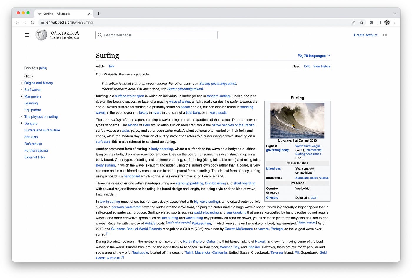
프로젝트가 진행되면서, 난 풀-프로토타입(클릭이나 스크롤 등 눈속임이 아닌 프로토타입)은 다른 목업이나 클릭정도 사용하는 프로토타입에 비해 훨씬 명확하게 디자인 소통을 할 수 있다고 믿게 되었다. 더 고품질의 논의나 피드백 또한 가능했다.
Coming out on the other side of this project, I strongly believe that fully interactive prototypes (versus mockups, or even a click-through prototypes), communicate designs significantly more clearly, and facilitate higher quality discussions and feedback. (For more notes on the fidelity of prototypes check out The 5 Dimensions of Prototype Fidelity).
Visual design 시각 디자인
만약 위키피디아의 예전 버전 인터페이스를 찾고있다면, 아마 각 버전은 나름의 성격-성질을 가지고 있단걸 알게 될 것이다. 특이한 색상, 선 스타일, 옅은 배경 이미지, 탭 스타일, 혹은 다른 별난 것들도. 맨 처음, 난 이런 전통을 이어가야 한다는 압박을 약하게나마 느꼈고, 새로운 성격을 제안하게 되었다. 그러나 나를 포함해 우리 팀원들이 선이나 버튼, 그라데이션, 아이콘, 타이포그래피를 갖고 놀면 놀 수록 우리는 이런 스타일 변화의 기능과 목적에 대해 질문하기 시작했다. 그리고 우리는 어떤 '로직'에 의한 변화가 필요하다는 걸 느끼게 되었다.
If you look at past versions of the Wikipedia interface, you’ll notice that each version has a personality of sorts. A unique color, border style, subtle background image, tab style, or other such eccentricities(기이한, 별난 행동). At first I felt a bit of a pressure to keep with this tradition, and come up with a new personality. But the more Kieran, Roy, Angy, and myself played around with borders, buttons, gradients, icons, typography, and other things, the more we questioned the function/utility of these stylistic changes, and the more we felt the need to ground our explorations in some logic.

시각디자인은 감정을 불러일으키거나, 개념적인 아이디어를 전할 때 사용될 수 있다. 그러나 디자인은 개인적이고 주관적이라는 해석에 따르면, 어떻게 전 세계-전연령의 사용자에게 자유로운 공동 지식의 개념을 전달할 것인가? 또한 비주얼 디자인은 특정 브랜드를 구분짓기 위해 사용될 수도 있지만, 위키피디아에 있어선 이런 신호들이 이미 콘텐츠 자체로 위키피디아의 색을 드러낸다(정보 박스, 파란 링크 등). 그리하여 어떤 감정을 불러일으키거나 브랜드를 강화시키려는 시도보단 '기능'에 초점을 맞추기로 했다. 기능에 초점을 맞춘 채 웹사이트의 이전 버전들을 확인했고, 시각 디자인이 기능적으로 사용되었다는 걸 발견했다. 디자인은 아티클, 메뉴, 사용자 툴 등 인터페이스의 각 부분들을 분리시키는 걸 도왔다. 우리의 리디자인된 인터페이스를 살펴 봤더니, 공간 위계와 각 요소들의 배치가 이미 화면을 세개로 강력하게 나누고 있다는 걸 발견했다:
Visual design can be used to evoke a feeling, or communicate a conceptual idea. But given that the interpretation(해석, 이해) of the design is personal/subjective, how do you communicate the idea of free, collaborative knowledge to a global audience, across a wide age range? Visual design can also be used to signify a specific brand, however for Wikipedia this signal is already established via the content itself (infoboxes, blue links, etc.). So rather than trying to evoke a feeling, or reinforce the brand, we fell back to focusing on functionality. We looked at past versions of the website through this perspective, and found that visual design was being used functionally, to help separate different parts of the interface: article, menu, user tools, etc. (see related WCAG design pattern) . Looking at our redesigned interface, we felt that the spatial(공간의) hierarchy and positioning of elements was already doing most of the heavy lifting to create these separations:
인터페이스를 나누는 여러 버전의 프로토타이핑을 제작해보고 위와 같은 생각을 이어나갔다. 몇 지역의 사람들은 시각적 분리가 더 확실해질수록 읽기 경험을 비롯한 화면의 전반적인 이해도가 더 좋아질거라 느꼈다. 우리는 이에 대해 아직 결론을 내진 못했지만, 읽고 참여할 수 있는 멋진 논의가 있으니 확인해보라. (링크)
We brought this thinking, as well as a prototype with various options for separating the parts of the interface, to the community. Some people felt that the reading experience, as well as the general comprehension of the interface, would benefit from more clear visual separation between the various regions. We have not yet reached a conclusion about this, but there’s a great discussion you can read through, and participate in, here.

Wikipedia articles are often very long 위키피디아의 아티클은 때로 매우 길다.
위키피디아 아티클의 길이는 읽기 경험에 있어 콘텐츠 목차의 중요성을 만들기도 한다. 목차는 독자들이 콘텐츠를 전체적으로 조망하고 구조를 알 수 있게 한다. 또한 현재 위치를 파악하고, 현재 어디 있는지, 그리고 어디에 있었는지 그 감각을 유지할 수 있는 지도로서 작동하기도 한다. 이전에 목차는 최상단 페이지에서만 사용할 수 있었다. 때문에 긴 아티클을 읽고 있다면, 목차 중 한 링크를 클릭한 뒤 다시 목차로 돌아가고 싶다면 스크롤을 한참 올렸어야 했다. 우리는 목차가 항상 사용 가능해야한다는 판단을 내렸다.
질문 중 하나는 이것이었다: 콘텐츠 목차를 고정된 사이드바(흔한 패턴인)에 둘 것인가? 혹은 인라인에 배치하고 추가로 나오게 할 것인가? 인라인으로 배치하면 공간을 확보할 수 있다. 긴 섹션의 헤더, 다양한 위계의 서브헤더는 이슈를 제대로 드러내지 못한다. 최대로 확장된 콘텐츠 목록을 보여줄 수도 있다. (긴 아티클이 때론 화면 전체를 차지할 수도 있지만) 그러나 인라인은 목차를 첫 섹션 아래에 둔다면 첫 섹션이 매우 길 때 랜딩된 첫 화면에서 목차를 볼 수 없다는 단점이 있다. (첫 섹션의 길이나 스크린의 너비를 고려한다면). 목차가 사이드바에 있다면, 이는 공간적으로 확실한 구획이 되어 강제된 것 처럼 보일 것이다. 그러나 큰 장점은 페이지에 랜딩 됐을 때 바로 볼 수 있다는 것이며, 언제나 같은 자리에 남아있을 거라는 거다. 우리는 5가지 옵션을 가지고 서로 다른 세 나라에서 사용자 테스트를 진행했고, 결과는 감사하게도 명확했다: 고정된 사이드바에 목차를 배치하는 것이다.
또다른 큰 결정은, 긴 아티클에서 목차의 서브 섹션들을 접을 수 있게 한 것이다. 때로 아티클에 섹션과 부섹션이 너무 많을 대, 목차는 너무 길어지기 마련이고 페이지를 스크롤하지 않으면 목차 전체를 볼 수 없을 때도 발생한다. 이는 전체 아티클의 개요를 빠르게 파악하기 어렵게 만든다. 섹션이 총 28개 이상일 경우 서브섹션을 접어두는 결정으로, 스크롤링 하지 않아도 목차의 내용을 모두 살펴볼 수 있다. (최소 최상위 레벨의 섹션들을). 이는 전체 페이지의 콘텐츠를 빠르게 습득할 수 있게 한다.
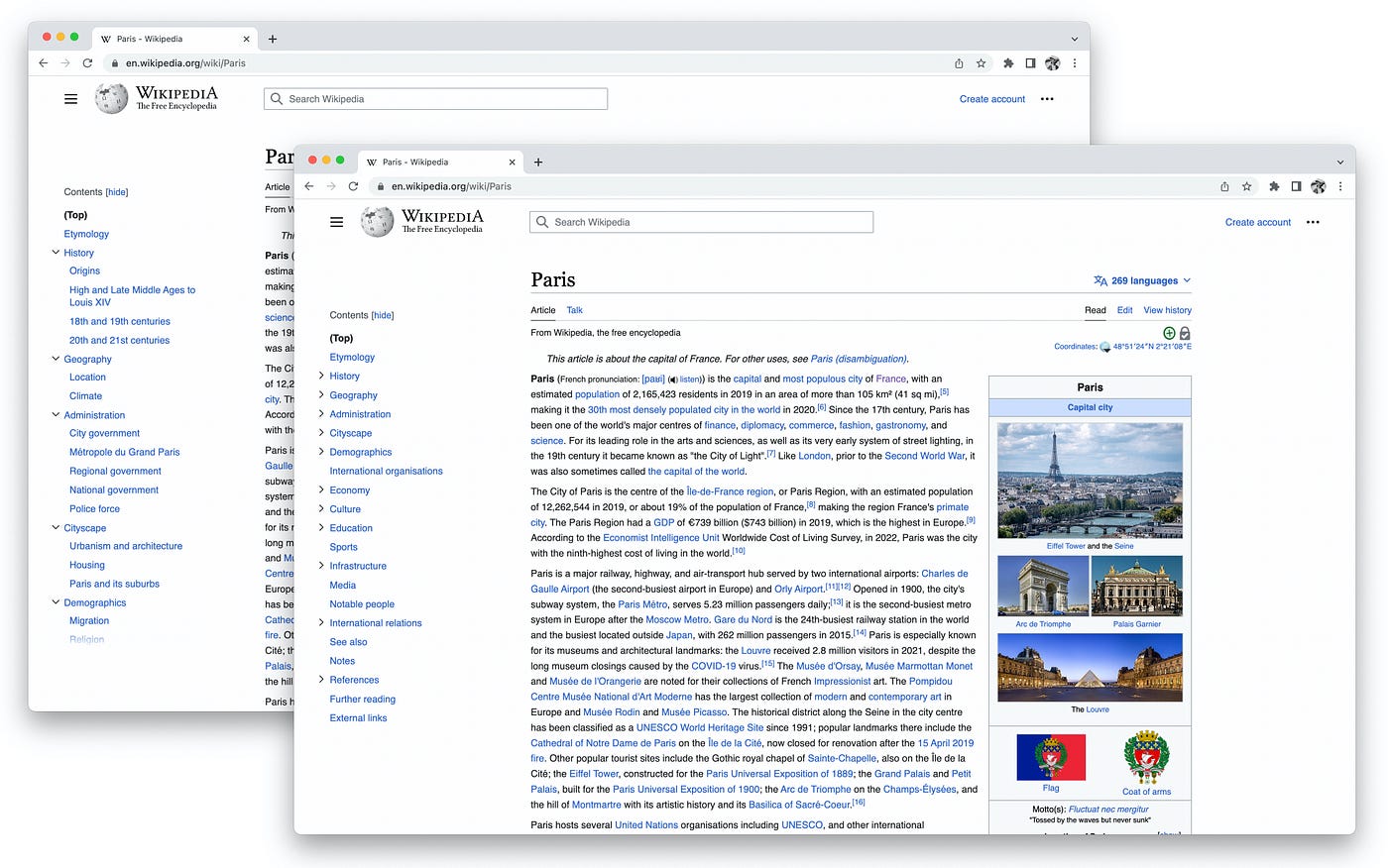
The length of Wikipedia articles makes the table of contents a particularly important part of the reading experience. It allows readers to get an overview of the content and structure of the article, it helps them locate what they are looking for, and (because it now dynamically tracks your position within the article) it serves as a map that helps you maintain a sense of where you are and where you have been. Previously the table of contents was only available at the top of the page. So if you were on a long article, clicked a link in the table of contents, then wanted to get back to it, you had to scroll all the way back up. Our inclination(의향, 경향) was that it should be always available.
One big question was: should we make the table of contents a fixed sidebar (which is a common pattern), or keep the table of contents inline (a longstanding Wikipedia thing), and then add a supplemental table of contents that appears once you’ve scrolled past the inline one? With an inline table of contents you get as much space as you need to display it. Long section headings, and many levels of nested sub-headings, don’t present an issue — you can display the fully expanded table of contents (though on long articles it often takes up your entire screen, or more). However, inline means putting it below the lead section, so sometimes when you land on the page you can’t see the table of contents at all without scrolling (depending on the length of the lead section, and the width of your screen). When the table of contents is in a sidebar, it’s much more spatially(공간적으로) constrained(부자연스러운, 강요된, 제약). However the big upside(장점) is that it’s immediately visible when you land on the page, and always remains in the same place. We ran extensive user testing on 5 different options (1, 2, 3, 4, 5), in 3 countries, and the results were thankfully clear: make it a fixed sidebar.
Another fairly big decision we made was to collapse sub-sections in the table of contents for longer articles. Sometimes, when an article has many sections and sub-sections, the table of contents is very tall, and you are unable to see all of it without scrolling the page. This makes it difficult to quickly get an overview of the entire article. By collapsing sub-sections for articles with more than 28 sections total, you can see all top-level sections within the table of contents without scrolling. This allows you to quickly learn the contents of the entire page.
이 외에도 재미난 작은 결정들이 있는데, 예를 들면 :
- 부섹션이 접혀있는 섹션을 스크롤 할 때, 섹션이 자동으로 펼쳐져야 할까?
- 목차의 링크를 클릭하면 화면이 스크롤 되어야 할까, 아니면 애니메이션 없이 즉시 화면 전환이 이뤄져야 할까?
- 부섹션이 접혀있는 아티클을 위해 "모두 펼치기"같은 버튼을 만들어야 할까?
- 섹션이 4개 이하인 아티클을 위해서라면 목차를 계속 숨겨둬야 할까?
좀 더 자세한 내용과 그 이유를 살펴볼 수 있다. (링크)
There were also lots of smaller decisions that were fun to think through, like:
- When you scroll to a section that has collapsed sub-sections, should the parent section automatically expand? (prototype link)
- When you click on a link in the table of contents should the scroll be animated or instant? (prototype link)
- Should we have an “expand all” button for articles with collapsed sub-sections? (prototype link)
- Should we continue hiding the table of contents on articles with less than 4 sections? (task link)
You can read about more of the details and rationales here


