최근 디자인산업과 과거 및 원리와의 가벼운 비교, 앞으로의 방향을 한발 물러서서 다시 생각해야하는 이유.
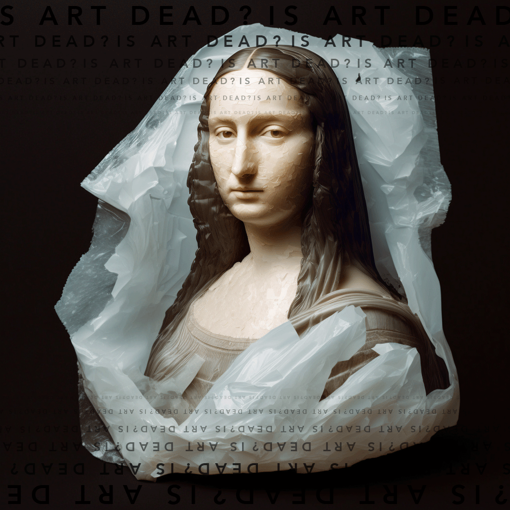
멋진 신세계 :
A brave new world
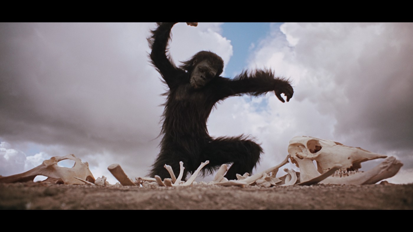
깊고 감성적이며 혁신적인 음악을 공예하듯 만들어내는 아티스트가 있던 시절이 있었다. end-to-end 컨셉과 경이로운 시적 가사, 녹음된 걸작을 앨범에 엮어 세상에 내보내 감탄을 불러일으키는 음악들을 만들었다. 경제적으로도 성공적이고 말이다. 혹은, 느리면서도 아름다운 오프닝, 깜짝 놀랄만한 촬영기법, 아이코닉한 음악과 함께 유인원이 뼈로 바닥을 치는 동안 드럼과 호른이 배경음악으로 흐르던 헐리우드 영화도 있었다.
오해하지 말라. 지금도 대단한 아티스트는 많다. 하지만 대부분 그들은 예술을 취미쯤으로 여기며 소셜미디어에서 좋아요를 구걸하며 한달에 300원쯤 번다.
현대 사회의 환경은 적절하면서도 세상을 바꿀만한 일을 하기 어렵게 만든다. 이제 현대에서 성공하는 건, 전개가 빨라 대중이 20초보다 짧은 틱톡 비디오에서 바로 알아챌만한 일회용 예술이다. 심지어 운이 좋아야만 알아 보겠지. 10억의 조회수가 나온다 한들, 단 한 명의 인생 변화도 없다.
그래, 좀 솔직해지겠다. 이런 말을 할 떄마다 나는 내가 그냥 늙었다고 느껴질 때가 있다. 하지만 난 다른 사람들도 나와 같은 시각을 가지고 있다는걸 안다. 이건 대중적인 의견이다. 그냥 꼰대들의 "아 나 땐 말야..."하는 게 아니란 말이다.
모든건 이제 일시적이고, 쉽고, 일회용이다.
There was a time when we had artists carefully crafting their deep, emotional and ground-braking music, with end-to-end concept(: The end-to-end principle is a design framework in computer networking. In networks designed according to this principle, guaranteeing certain application-specific features, such as reliability and security, requires that they reside in the communicating end nodes of the network.) and amazing poetic lyrics, further compiling the carefully recorded masterpiece into an album and shipping physical copies for the world to admire — and still being financially successful at it — or when Hollywood films had slow, beautiful openings, stunning photography and iconic soundtracks, with apes beating the floor with bones in their hands while all the wall-shaking drums and horns played in the background.
Don't get me wrong, we do have amazing artists nowadays, but most of them are probably doing their art as a hobby and earning 30 cents a month from it while begging for likes on their social media.
Our current world environment simply made it nearly impossible for people to actually work on relevant and world-changing stuff. What really succeeds is the fast-pacing, disposable art that people will notice it for 20 seconds on a TikTok video — if you're lucky.
Billions of views. Zero lives changed.
And I gotta be honest. When I say this, I feel that I might just be getting old, but I do see other people with the same perception. It's a general feeling. It's not just the "oh but in the old days…" kinda thing.
Everything is temporary, easy, and disposable now.
소프트웨어 디자인의 황금 시대
The golden age of software design
나는 꽤나 예상치 못한 방향으로 디자인 커리어를 시작했다. 10대였던 나는 정말 아무 이유 없이 블로그스팟의 멋진 템플릿들을 디자인해왔다 ㅡ 블로그스팟이 그 당시 브라질에서 꽤나 쿨한 문화였기도 하고.
나는 하루에도 수시간 포토샵을 했고, 내 인생에서 가장 좋은 시간을 보냈으며, 스큐어모피즘 효과를 내 시각 작업물에 따라 녹여보고, 빛나는 반사 효과를 따라하고, 최적의 서체를 찾고, 요소가 떠있는것처럼 보이게 드롭섀도우 효과도 디자인 했었다. 적절한 색 조합을 찾고, 이미지를 자르고, 이 모든 것들을 당시 사용했던 기능 얼마 없는 무료 HTML에서 구현되도록 했었다. 말도 못하게 느린 인터넷과 부서저가는 컴퓨터에서 말이다.
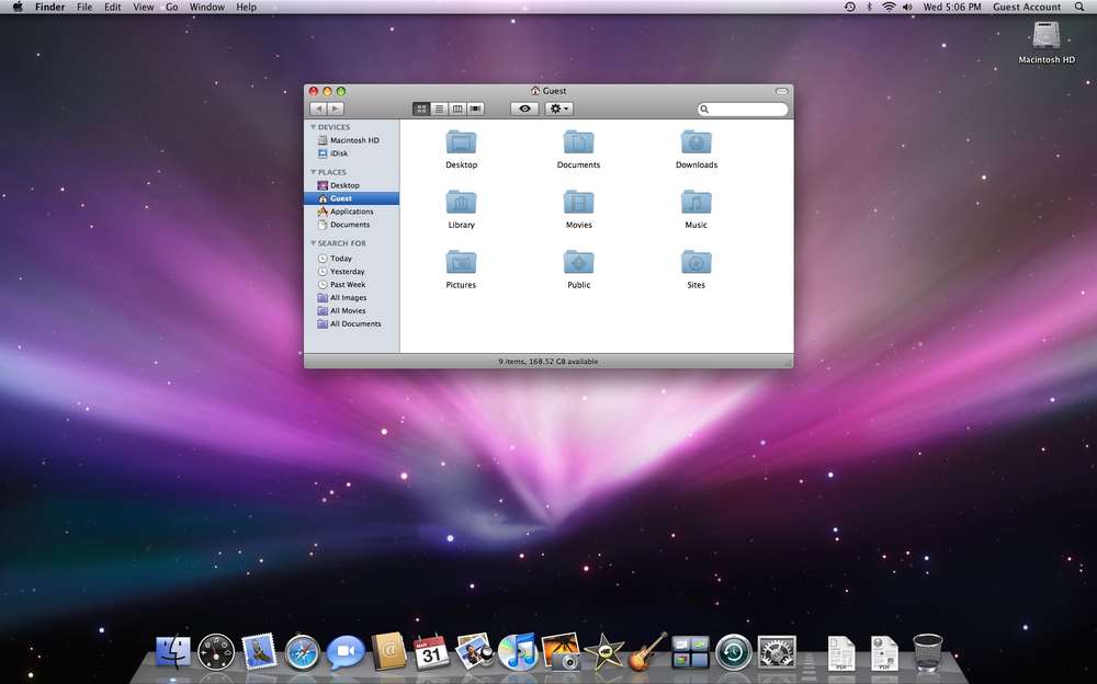
그로부터 얼마 되지 않아 첫 Mac OS였던 레오파드를 썼던걸 기억한다. 어렸던 나는 문자 그대로 매료됐다. 모든 디테일과 섬세하게 제작된 아이콘, 반투명 버튼, OS에서 윈도우를 최소화 했을 때 나오는 끝내주는 애니메이션을 살폈다. 사용하기 너무 편했고, 만족스러웠다. 글로는 표현할 수 없을 정도로 보는 모든 것들이 강렬했다.
I started my design career in quite an unexpected way. As a teenager I'd frequently find myself designing cool templates for my old Blogspot page for absolutely no reason— yeah Blogspot was a thing in Brasil back in the day.
I used to spend hours and hours on Photoshop, having the best time of my life, figuring out how to replicate the skeuomorphic effects on the visual elements I was crafting, simulating shiny reflections, choosing the perfect font, designing a realistic drop-shadow to make it pop. Finding just the right color combination, slicing images, and making everything work with a very limited free HTML tool I used at the time — all this on a super slow internet connection and a falling-apart computer.
Not so long after that, I remember when I first came across Mac OS Leopard. The young me was simply amazed. I would just look at all of the details, the carefully crafted icons, translucent buttons, and stunning animations they added when you minimised a window. It was so easy to use, and the satisfying feeling I had while looking at all this was so intense I can't even describe it!
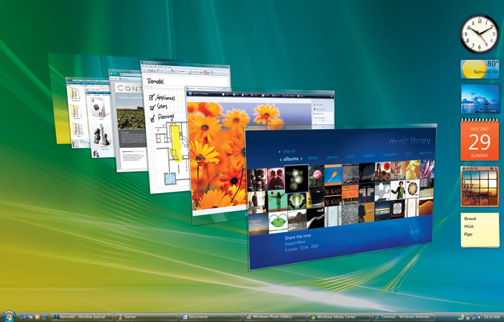
끔찍한 퍼포먼스와 기능에 대해선 딱히 말할건 없지만, 윈도우 비스타도 또한 인터페이스는 시대를 앞서갔다. 윈도우는 반투명 유리ㅡ글래스모피즘을 2007년에 사용했으니까 말이다! 그당시엔 꽤나 인상적이었다. 외관은 괜찮았지만... 글쎄, 기능이 꽤나 부족했었다. 그러나, 매우 성공적이었던 윈도우 7이 나오는데 단단한 기초가 됐다. 그 윈도우는 지금까지도 수백만의 사람들이 사용하고 있고 말이다.
Not to mention Windows Vista, with its horrible performance and functionality, but for sure the interface was ahead of its time. They simulated frosted glass (glassmorphism) in 2007! This was really impressive for the time being. The form was there, but well… of course it lacked function pretty much entirely. However, it served as a solid base for the hugely successful Windows 7 that came right after — which by the way is still used by millions even today.
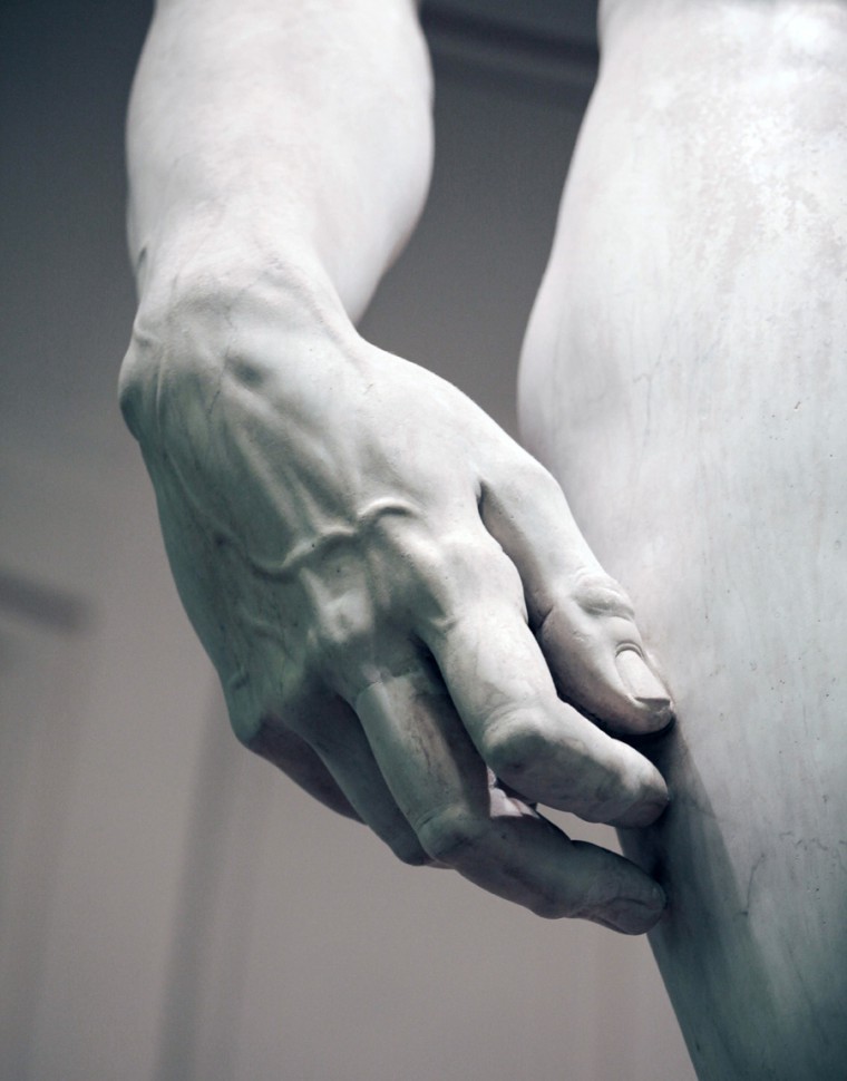
옛날 소프트웨어를 예로 들어 황금시대를 논하는게 좀 웃기고 어색할 수도 있겠다. 그러나 중요한 사실은 이 OS나 다른 혁신적이었던 오래된 소프트웨어는 매우 아티스틱하고 "공예적"인 방식으로 만들어졌다는 것이다. 지금 우리가 사용하는 복잡한 프레임워크나 프로세스 없이, 피그마도 스케치도, 미로도, 메이즈도, 모빈이나 당신이 지금 떠올리고 있는 다른 어떤 툴도 없이 만들어졌다. 물론 그 당시 잘 사용하던 프로세스나 프레임워크를 사용했을 수는 있겠지만, 일반적으로 작업 자체가 훨씬 창의적이었다. 픽셀 하나하나를 다듬고, 생산해낸다. 그리고 이는 꽤 재밌는 방식이기도 하고. 어떤게 디자인의 중심이고 아닌가? 무엇이 진짜 중요한건가?
It might seem silly and awkward that I’m referencing old software as an example of a golden age. But the reality is, these and other amazing and ground-breaking old software were made in a very artistic and "crafty" way, without most of the many complex frameworks and processes we have today, and also with no Figma or Sketch, no Miro, no Maze, no Mobbin or whatever other tool you may think of. I'm sure they used other types of processes and framework, but in general the work was richer in creativity and pixel crafting than today, and this is an interesting thing to think about.
What's really core design and what isn't? What really matters?
멋진 신산업 : A brave new industry
일반적인 디자인 작업은 조금씩 자동으로 가동되는 업무가 되어가고 있다. 디자이너들은 이제 창조자보단 촉진자 역할에 집중하고 있다. 우리는 상호 창조적인 그룹을 관리하고, 반복되는 미팅에서 살아남고자 하며, 끝없는 서베이와 함께 모빈(앱 스크린샷 모음 사이트)의 벤치마크나 데스크 리서치를 기반으로 가장 최적화된 유저 플로우를 찾는다. 메이즈 테스트(유저 테스트 플랫폼)를 진행하고, 지칠 줄 모르고 그들이 뭘 원하는지 살펴보며 그들이 기대하는 것을 디자인한다. 왜? 사용자 분석이 그 방향으로 가라고 했으니까. 특히 요즈음 변화하고 있는 분위기상 더더욱 사용자 분석이 중요해졌다.
현대 기술문화는 쉽게 달성할 수 있는 목표, 빠른 승리, MVP(최소기능제품), 가장 최적화된 사용자 플로우에 전적으로 포커싱 되어있다. 좋다. 좋고말고. 그런데 당신이 한 번 MVP 모드에 빠져있다면, 거기서 빠져나오긴 쉽지 않을 거다.
한 어린 학생이 한번은 나에게 "제가 디자이너가 되려면 UI를 알아야 하나요?"라고 물어봤는데, 그 때 나는 가슴이 미어졌다. 우리가 우리를 세상에 어떻게 소개시켜 주는지에 대해 놀란 적도 없지만 말이다. 모든 작업과정과 프레임워크, 사용할 수 있는 툴, 높은 연봉, 링크드인의 창의적으로 보이는 온갖 타이틀, 우리가 얼마나 똑똑하고 이 일이 얼마나 어려운 건지 끊임없이 어필해왔지 않는가.
그래, 그건 사실이다. 현재 우리는 더 똑똑하고, 더 빠르다. 그런데 우리 주변의 디지털 제품은 대부분... 그래, 대부분 그다지 인상적이지 않지 않은가? 당신이 매일 쓰고 있는 앱을 한 번 유심히 봐라. 몇몇을 제외하곤 다 기본적으로 비슷하다.
The average design work is slowly becoming a robotic operational task. Designers are diving into a facilitator role more and more, rather than a creative role. We're managing co-creation groups, surviving meeting after meeting, survey after survey, looking for the most optimal user flow based on some benchmark on Mobbin or desk research. Maze testing with users, tirelessly looking for what they want and designing what is expected to be designed because “the user analytics points to that direction”, specially now with the vibe shift we are facing today.
Modern tech culture is all about the low-hanging fruits, the fast wins, the MVPs, and the most optimised user flow. And that’s all fine. But once you’re in MVP mode, you'll never really get out of it.
A young student once asked me "do I need to know UI if I want to be a designer?" and I was heart-broken, although I wasn't even surprised given how we are presenting ourselves to the world now, with all our processes and frameworks, tools, high salaries, creative titles on LinkedIn, and how we constantly show that we're smart and that our job is difficult.
Sure, it's true. We are definitely a lot smarter and faster now. But then you look at most of the digital products around and… they're not so impressive anymore, are they? Have a deep look at the apps you use every day. They're basically all the same, with a few exceptions.

우리의 모든 워크플로우와 루틴은 상사와 주주들이 우리가 열심히 일하고 있다고 생각하게 한다. 반면 우리가 형태, 기능, 창조, 공예와 같은 '기본'에 동일한 양의 노력을 붓지 않으면, 모든건 쓸모가 없어진다.
솔직해져보자. 이 중요한 부분을 잃은 상태에서 당신은 그냥 가장 잘나가는 경쟁자의 화면가 플로우를 복사 붙여넣기 하고 있진 않는가? 그냥 버튼 색이나 일러스트를 조금씩 변경하고, 로고를 뒤집어보고... 결국 크게 다를 바 없는 결과물로 끝이 날 것이다. 모든 프로덕트들이 똑같이 생겼다 한들, 누가 신경쓰겠는가? 사용성 테스트나 환산률에서 성공적인 결과를 얻을 거고, 심지어는 이익조차도 잘 날텐데 말이다! 이 과정은 꽉찬 일년의 작업 대신 한 세시간쯤 걸릴거고, 백명쯤 되는 디자이너는 필요도 없다. 한 명이면 충분하니까.
10억명의 사용자들, 그리고 슬프고ㅡ못난 세상.
디자이너라는건... 그 이상의 일이다. 우리는 그냥 전환률을 높이려고만 일하는게 아니다. 그건 결과일 뿐이지. 우리는 세상에 더한걸 보여줄 필요가 있다.
All of our workflows and routines surely make our boss and stakeholders think we're working hard, but if we don't put the same amount of effort into the basics — form and function, creativity, craft— everything is just useless.
And let's be honest, while missing the most important part, you might as well just copy and paste your most successful competitor's screens and flows, change the button colour and illustrations, flip the logo, and you will probably end up with a very similar output. All products look the same anyway, who cares? You'll even have successful usability tests and conversion rates(전환률), or even profit! — And this would only take 3 hours instead of a full year of work, and only one designer instead of a hundred.
1 billion users. A sad and ugly world.
Being a designer is way more than that. The work is not only about raising conversion rates. This should be a consequence. The world deserves more.
그럼 그 다음 스텝은? What's the one step further?
좋아, 여기가지 우리 루틴을 살펴봣고, 우리가 과도하게 섭취하는 라떼와 스탠딩데스크, 너무 적은 공예적 작업에 대해 걱정을 좀 해봤다. 그럼 다음 단계는 뭘까?
현 산업 내 모든 혁신적인 서비스들, 특히 물리적 서비스엔 특별한 인간미와 표현법이 있다. 디자인 안에 예술이 있고, 예술 안에 디자인이 있다.
사용자는 로봇이 (아직) 아니며, 백이면 백 사람이다. 심지어 B2B 서비스조차 말이다. 그런데 여기서 인간적 표현이나 직감, 불확실성, 위험 부담, 온기, 감정을 넣지 않느다면 생명력 없는 그저 슬픈 결과물을 하나 만들어 내는 데 그칠 것이다. 뭐, 이게 작동할 수는 있을 것이다. 활성 사용자와 수익은 낼 수 있을 것이다. 고장난 시계도 하루에 두 번은 맞지 않겠는가. 그렇지만 그 시계가 잘 작동하는 좋은 시계라고는 할 수 없겠지.
좀 더 깊게 들어가보자. 마지막 한 픽셀까지 카드의 border radius(모서리 둥글게 처리하기)를 다듬고, 카피에 감정을 좀 더 실어보자. 당신이 생각한 미친 아이디어를 출시해보자. 작업에 기분좋은 흥분을 느껴보자. 획일화된 패턴을 부셔보자. 컴포넌트를 하나 떼내보자! 혁신적인 사용자 여정을 찾아보고, 예전의 지루한 방식에서 벗어나 새로운 인터렉션을 찾아보자. 끝내주게 만족스러운 애니메이션 커브를 만들어보자. 심미성을 위해 자연의 패턴을 배워보고, 룩앤필을 적용해보자. 디지털 너머로 나아가자. 조각, 사진, 음악, 건축, 회화, 산업 디자인 뿐 아니라 추상미술까지 깊게 파고들어가자. '미'를 찾고 이해해 당신 주변의 세상의 가치를 높이자.
프로덕트가 주의깊은 관찰과 완벽한 세심함으로 만들어졌다는걸 사용자에게 인식시켜라. 그들이 만들어내는 전환률이라는 숫자가 아니라, 오직 '그들'을 위해서. 빛나게, 아름답게 만들자. 인간이 낼 수 있는 능력을 최대한 활용해 최고로 좋은 것을 만들자. 언제나.
Ok, so we’re caught up in our routines, worrying too much about our Latte and our standing desks, and too little about our craft. But what’s the step further?
Here’s the thing… Every single amazing product in the industry right now, especially the physical ones, has a unique human touch and expression to it. There’s art in design, and there’s design in art.
The users are always people, not robots (yet) – even for B2B products – and if you don’t put that human expression, the gut feeling, the uncertainty, the risk-taking, the warmth, the emotions, you’ll then create a lifeless, sad creature. It might even work, and even have active users and profit, but even a broken clock is right 2 times a day. Doesn’t mean it’s a good clock.
Dig deeper. Craft the border radius of that card to the last pixel, add a little bit more emotion to that copywriting, release that crazy non-sense feature you thought about. Feel excited about it. Break the pattern. Detach the component(ooh! that's a juicy one). Find an innovative user journey, find a different interaction approach to that boring old form. Make that animation curve extremely satisfying. Study what are the patterns in nature for aesthetics and apply them to the look and feel. Go beyond digital. Dive deep into sculpture, photography, music, architecture, painting, industrial design and even abstract art of all forms. Find and understand beauty and how it enhances the world around you.
Make it clear to your users that the product was crafted with close attention and absolute care. Not for the conversion rates, but for them.
Make it shine. Make it beautiful. Make it the best humanly possible.
Every time.
형태와 기능이 새로운 혁신이다 : Form and Function is now innovation
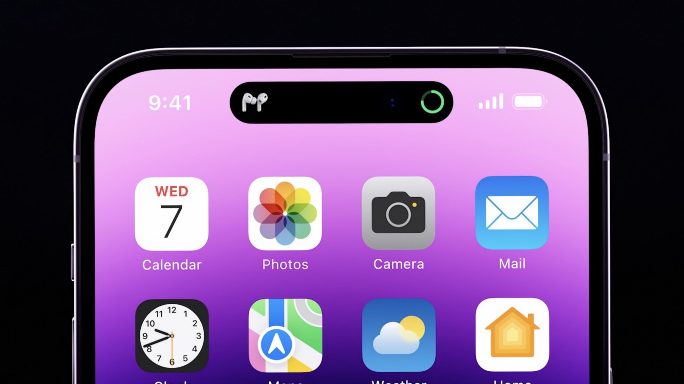
애플은 최근 "다이나믹 아일랜드"를 출시했다. 말 그대로 독에 앱을 최소화 시킨 버전인데, 스타일을 살렸다. 다이나믹 아일랜드 같은 스타일리시한 방법, 사실 할 필요는 없었다. 하지만 그들은 했다. 그리고 이 작은 인터렉션이 2022년 디자인 커뮤니티를 아주 뒤집어 엎었다.
사람들은 경탄했고, 한 2주간은 다이나믹 아일랜드에 관해서만 말했다. 링크드인에 수백만개의 포스트와 아티클이 이 "제한을 포용한 다이나믹 아일랜드"를 앞다퉈 말했다. 놀람 그 자체였다. UI 인터렉션으로만 말이다. 그렇다. 디자인의 힘이 이렇게나 크다. 그리고 모든 경쟁자들이 그들을 따라하고 있다.
Apple released the "Dynamic Island". It's literally minimising applications into a Dock, but with style. They didn't have to do it. But they did it. And this little interaction is what turned the design community upside down in 2022.
People were amazed, they only talked about that for 2 weeks. They wrote millions of giant LinkedIn posts and articles about "Embracing constraints". But people were jaw dropped. By a UI interaction. Yes, Design is THAT BIG. And every competitor is copying them now.
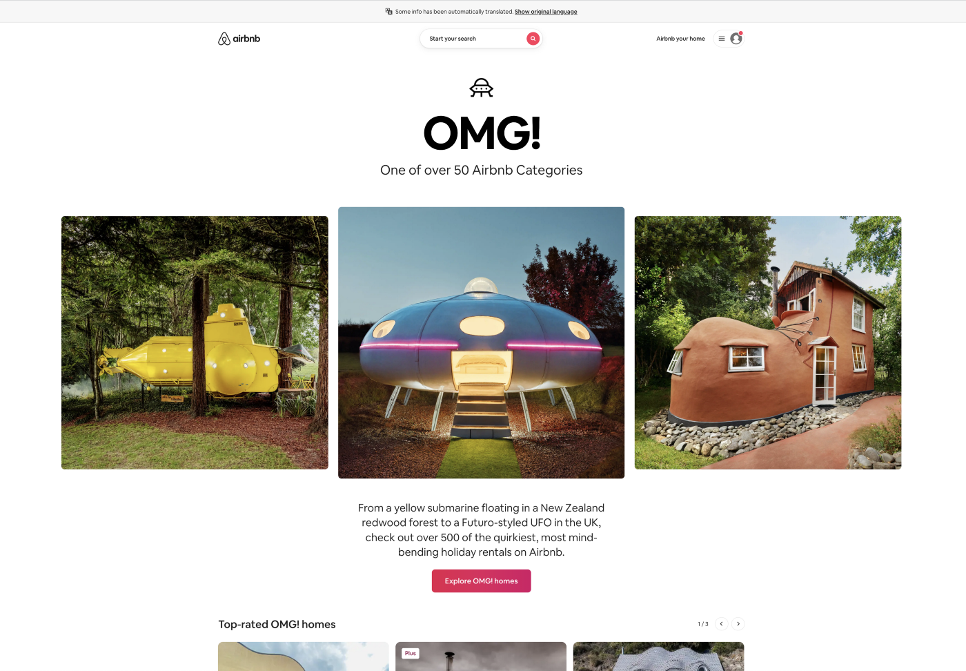
에어비앤비는 "OMG"이라는 카테고리를 신설했는데, 이 또한 링크드인이나 미디움같은 플랫폼에서 다뤄졌다. 사람들은 언제나 이런 작지만 큰 디테일에 감동을 받는다. 예상치 못한 창의적인 인사이트들 말이다. 작지만 거대한 한 보 전진이다.
Airbnb released their "OMG" category and this also made it to the big media and major communication platforms, as well as LinkedIn and Medium all over the place. People are always impressed by these little giant details. The creative insights, the unexpected.
The one little giant step further.
세상을 바꾸기 위해선, 복잡한 수식이나 계산이 필요하지 않다. 디자인은 인간과학이다. 그렇기 때문에 카테고리로 나눌 수 없다. 당신이 해야하는건 사용자가 원하는걸 '보여주는' 것이다. 성공 전에는 분명 실패를 해야만 할 것이다. 그럼에도 전진해야 하며, 성공하기 위해 도약해야 할 것이다. 여기 그 차이가 있다. 앞서 말했던 "한 걸음 더" 말이다. 이는 모든 좋은 디자인의 근본이며, 우리가 새어보내선 안될 것이다.
감을 놓지 말아라. 본능을 믿고, 실패하는걸 두려워하지 말아라. 단순히 분석에 의해 위험성 적은 선택만 반복하지 말아라. 결국 구린 아웃풋만 낼 것이다.
디지털 툴을 사용하되, 언제나 가장 주된 툴은 당신의 뇌라는걸 잊지 말아라.
다시 트랙으로 돌아가 당신의 직관을 믿고, 서로다른 아이디어를 실험하고, 찾을 수 없는걸 찾아보려 애쓰고, 사용자가 피드백한 그 이상으로 넘어가라. 사용자는 본인이 뭘 원하는지조차 모를 것이기 때문이다. 그들이 원하는걸 그들에게 묻지 말고, 그들에게 보여줘라.
쉽고 빠르게 버려지는 이 시대에 함께 빨려들어가선 안된다.
자신의 시간을 갖고, 새로운 길을 찾아 나서라. 멋진 것을 만들자.
즐겁게, 디자인하자.
In order to change the world, there's no math. Design is a human science, and it's categorised like that for a reason. You need to show your users what they want. You need to fail before you succeed. You need to go for it, take the big leap to find it. And that's the difference. That's the "one step further". That's what good design is all about, and that's where we can't let it slip.(새어나가다)
Don't ever lose the feeling. Trust your gut, don't be afraid to fail and don't only take low risk actions day after day based on analytics. This sucks.
Use your tools, but mainly use your brain.
Get back on track, trust your intuition(직관), test different ideas, look for the unfindable, go beyond what a user told you, they (probably) don't even know what they want. Show them what they want.
Don't fall blindly into this fast disposable world.
Take your time. Find new ways. Make great things.
Have fun.
Design.
원문 :
Product design is going down a weird path, but we can still save it
A casual analysis of our current design industry compared to the old days and principles, and why it's important to step back and re-think…
uxdesign.cc
'Article 번역' 카테고리의 다른 글
| The many deaths of UX design / UX 디자인계의 칼바람(1) (0) | 2023.02.19 |
|---|---|
| Hey Slack Design, 기술 실력을 늘리거나 새로운 스킬을 배우는 가장 좋은 방법이 뭐야? (0) | 2023.02.06 |
| Designing for the World: An Introduction to Localization (0) | 2023.01.29 |
| How Roadmaps Accidentally Make Teams Powerless / 로드맵은 어떻게 우연히 팀을 무력화 시키는가? (1) | 2023.01.22 |
| User Research is a Waste of Time / 사용자 리서치는 시간 낭비다. (1) | 2023.01.15 |


