Context Menus
컨텍스트 메뉴
In iOS 13 and later, you can use context menus to give people access to additional functionality related to onscreen items without cluttering the interface.
iOS 13 포함 이후 버전에선, 컨텍스트 메뉴를 사용해 화면을 어수선하게 만들지 않고도 아이템과 관련된 추가 기능에 접근하게 할 수 있습니다.
Context menus are similar to Peek and Pop, but with two key differences:
- Context menus are available on all devices running iOS 13 and later; Peek and Pop is available only on devices that support 3D Touch.
- Context menus immediately display contextually relevant commands; Peek and Pop requires a swipe up to view commands.
컨텍스트 메뉴는 Peek and Pop과 비슷하지만, 두가지 중요한 차이가 있습니다:
- 컨텍스트 메뉴는 iOS 13 포함 이후 버전의 모든 기기에서 사용 가능합니다; Peek and Pop은 3D 터치를 지원하는 기기에서만 사용 가능합니다. (=> iPhone XR은 사용 불가능)
- 컨텍스트 메뉴는 즉시 관련한 명령을 보여줍니다; Peek and Pop에선 명령을 보기 위해 위로 스와이프 해야합니다.
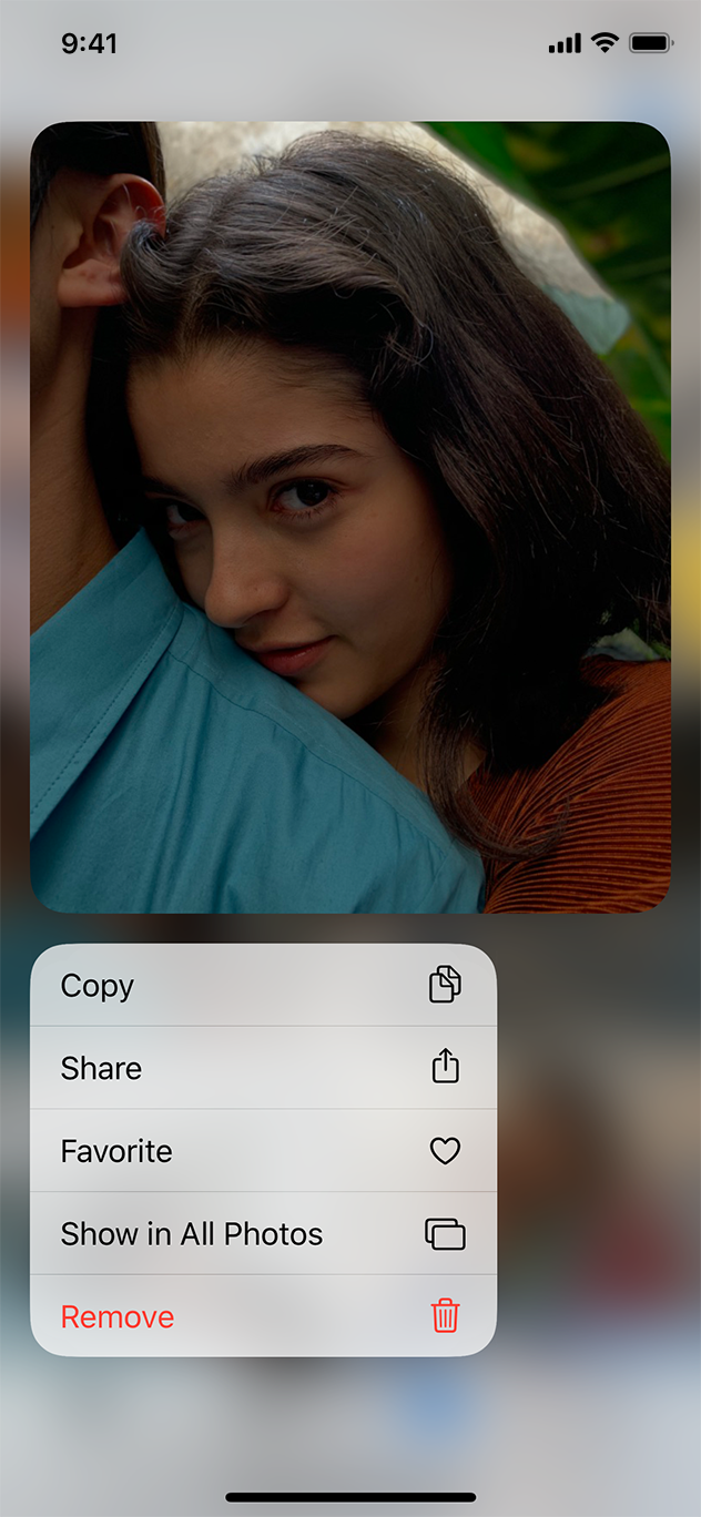
To reveal a context menu, people can use the system-defined touch and hold gesture or 3D Touch (3D Touch can make context menus appear more quickly). When open, a context menu displays a preview of the item and lists the commands that act on it. People can choose a command or drag the item to another area, window, or app.
시스템의 터치 앤 홀드 제스처나 3D 터치를 사용해 컨텍스트 메뉴를 볼 수 있습니다. (3D터치를 사용했을 때 더 빠르게 접근할 수 있습니다.) 컨텍스트 메뉴가 열리면, 아이템을 미리 볼 수 있고 그 아이템에 행할 명령 리스트도 나옵니다. 사용자들은 명령을 선택하거나, 아이템을 다른 영역, 윈도우, 앱으로 드래그할 수 있습니다.
Adopt context menus consistently. If you provide context menus for items in some places but not in others, people won’t know where they can use the feature and may think there’s a problem with your app.
컨텍스트 메뉴는 일관되게 계속 적용하세요. 일부 영역의 아이템에만 콘텍스트 메뉴를 지원한다면, 사용자들은 어디서 그 기능을 사용해야 할지 모를 것이며, 나아가 앱 자체의 문제라고 생각할 수도 있습니다.
Include only the most commonly used commands that apply to the item. For example, in the context menu for a Mail message, it makes sense to include commands for replying and moving the message, but it doesn’t make sense to include formatting or mailbox commands. Listing too many commands can overwhelm people.
해당 아이템에 가장 자주 쓰이는 명령만 포함시키세요. 예를 들어 메세지의 컨텍스트 메뉴라면, 답장하거나 메세지를 이동하는 기능이 적절할 것입니다. 반면, 서식을 만들거나 수신함 관련 명령은 논리적으로 맞지 않죠. 너무 많은 명령을 나열하는 것도 사용자를 힘들게 할 것입니다.
Include a glyph with each command in a context menu. A glyph reinforces the meaning of a command, helping people instantly understand its function. When you use SF Symbols, you can choose an existing symbol that represents your command or edit a related symbol to create a custom glyph. If your context menu includes a submenu, you don't need a glyph for it because it automatically displays a system-provided chevron symbol that indicates the presence of additional commands.
컨텍스트 메뉴의 각 명령엔 글리프를 넣으세요. 글리프는 명령의 뜻을 더 잘 알려줄 수 있고, 그 기능을 즉시 이해하는데 도움을 줍니다. SF Symbols를 사용하면, 당신이 지정한 명령에 맞는 심볼을 고를 수 있습니다. 또는 커스텀 글리프를 만들 수도 있습니다. 만약 콘텍스트 메뉴에 서브메뉴가 포함된다면, 그 서브메뉴엔 글리프를 포함시킬 필요 없습니다. 추가 명령임을 보여주는 쉐브론 심볼(>)이 자동으로 적용되기 때문입니다.
Use submenus to manage complexity. A submenu is a context menu item that reveals a secondary menu of logically related commands. Give submenus intuitive titles that describe their contents so people can predict the submenu's commands without revealing them. Concise, action-oriented titles also let people skip over submenus they don’t need in their current context.
서브메뉴를 사용해 복잡성을 줄이세요. 서브베뉴는 컨텍스트 메뉴의 아이템으로, 관련 명령 중 두번째로 중요한 메뉴를 보여줍니다. 해당 콘텐츠를 이해하기 쉬운 타이틀을 넣어 사용자들이 직접 선택해보지 않고도 서브메뉴의 명령이 무엇일지 예측할 수 있게 하세요. 간결하고, 액션을 직접 나타내는 타이틀 또한 사용자들이 지금 필요하지 않은 서브메뉴를 스킵할 수 있게 합니다.
Keep submenus to one level. Although submenus can shorten a context menu and clarify the commands that people can perform, more than one level of submenu complicates the experience and can be difficult for people to navigate.
서브메뉴는 단일메뉴로 유지하세요. 서브메뉴가 컨텍스트 메뉴를 줄일 수 있고, 사용할 수 있는 명령들을 간결하게 만들어주긴 하지만, 두개 이상의 서브메뉴는 경험을 복잡하게 만들고 탐색하기 어렵게 합니다.
Place the most frequently used items at the top of the menu. When people open a context menu, their focus is on the top area of that menu. Placing the most common items at the top of the menu helps people find the item they’re looking for.
메뉴의 최상단에는 가장 자주 사용되는 아이템을 넣으세요. 사용자들이 컨텍스트 메뉴를 열 때, 그들은 메뉴의 최상단에 집중합니다. 가장 자주 사용되는 아이템을 넣어 사용자들이 찾는 아이템을 바로 발견할 수 있도록 하세요.
Use separators to group related menu items. Creating visual groupings can help people scan a menu more quickly. For example, you might use a separator to group actions related to editing the item and another to group actions related to sharing the item. Typically, you don’t want more than three groups in a context menu.
분리 줄을 사용해 관련 메뉴 아이템의 그룹을 만드세요. 시각적 그룹을 만드는 것도 사용자들이 메뉴를 빠르게 스캔하는데 도움을 줍니다. 수정 관련된 아이템들과 공유 관련된 아이템들을 각각 구분지을 수도 있죠. 일반적으로 컨텍스트 메뉴엔 4개 이상의 그룹을 만들지 않습니다.
Avoid providing a context menu and an edit menu for the same item. It can be confusing to people and hard for the system to detect intent when both features are enabled for the same item. For additional guidance, see Edit Menus.
한 아이템에 대해 컨텍스트 메뉴와 수정 메뉴를 둘 다 제공하진 마세요. 두가지 기능이 한 아이템에 다 제공된다면, 사용자는 혼란스러울 것이고 시스템은 사용자가 어떤걸 사용하고 싶어하는지 알아채기 어렵기 때문입니다. 추가 가이드는 수정 메뉴를 참고하세요.
Avoid providing an action button that opens the item preview. People can tap to open the item they’re previewing, so there’s typically no need to provide an explicit Open button.
For developer guidance, see UIContextMenuInteraction.
아이템 미리보기를 여는 액션 버튼을 제공하지 마세요. 사용자들은 이미 탭해서 아이템을 미리 볼 수 있기 때문에, 또 다른 '미리보기 열기'은 필요 없습니다.
'Human Interface Guidelines' 카테고리의 다른 글
| 애플 휴먼 인터페이스 가이드라인(57) Controls -5 Labels (0) | 2021.03.02 |
|---|---|
| 애플 휴먼 인터페이스 가이드라인(56) Controls -4 Edit Menus (0) | 2021.03.01 |
| 애플 휴먼 인터페이스 가이드라인(54) Controls -2 Color Wells (0) | 2021.02.26 |
| 애플 휴먼 인터페이스 가이드라인(53) Controls -1 Buttons (0) | 2021.02.26 |
| 애플 휴먼 인터페이스 가이드라인(52) Views -12 Web Views (0) | 2021.02.26 |


