Tab Bars
탭바
A tab bar appears at the bottom of an app screen and lets people quickly switch among different sections of an app. Tab bars are translucent, may have a background tint, maintain the same height in all screen orientations, and are hidden when a keyboard is displayed. A tab bar may contain any number of tabs, but the number of visible tabs varies based on the device size and orientation. If some tabs can’t be displayed due to limited horizontal space, the final visible tab becomes a More tab, which reveals the additional tabs in a list on a separate screen.
탭바는 앱화면 아래 나타나 앱의 다른 섹션으로 빠르게 이동할 수 있게 도와줍니다. 탭바는 기본적으로 투명하나 배경 색상값을 가질 수도 있으며, 화면의 어떤 모드(가로/세로)에도 동일한 높이를 유지하고, 키보드가 나왔을 땐 가려집니다. 탭바는 어떤 수의 탭도 포함할 수 있긴 하지만, 탭은 기기 크기나 모드에 따라 보여지는 탭의 개수가 달라집니다.

TIP
It’s important to understand the difference between a tab bar and a toolbar, because both types of bars appear at the bottom of an app screen. A tab bar lets people switch among different sections of an app, such as the Alarm, Stopwatch, and Timer tabs in the Clock app. A toolbar contains buttons for performing actions related to the current context, like creating an item, deleting an item, adding an annotation, or taking a photo. For guidance, see Toolbars. Tab bars and toolbars never appear together in the same view.
For developer guidance, see UITabBar.
탭바와 툴바의 차이를 알아두는 것이 좋습니다. 둘 다 앱화면의 아래에 나오기 때문입니다. (!!!!) 탭바는 앱의 다른 섹션으로 이동할 수 있게 합니다. 시계 앱의 알람/스탑워치/타이머 탭이 그 예입니다. 반면 툴바는 현재 맥락과 관련된 액션을 수행하기 위한 버튼을 포함합니다. 아이템을 삭제하거나 만들고, 주석을 추가하거나 사진을 찍는 것입니다. 가이드는 툴바에서 확인하세요. 탭바와 툴바는 절대 같은 화면에서 함께 나오지 않습니다.
In general, use a tab bar to organize information at the app level. A tab bar is a good way to flatten your information hierarchy and provide access to several peer information categories or modes at the same time.
탭바는 앱 수준에서의 정보를 구조화하는데 사용하세요. 탭바는 정보 위계를 간단히 하고 같은 위계의 정보 카테고리나 모드를 동시에 접근할 수 있도록 합니다.
Use a tab bar strictly for navigation. Don’t use tab bar buttons to enable actions. If you need to provide controls that act on elements in the current view, use a toolbar instead.
탭바는 탐색을 위한 용도로만 사용하세요. 탭바에 액션을 취할 수 있게 하는 버튼을 사용하지 마세요. 만약 현재 화면에 작용하는 컨트롤이 필요하다면, 툴바를 대신 쓰세요.
Aim for the right number of tabs. Too many tabs reduces the tappable area of each tab and increases the complexity of your app, which can make it harder for people to locate information. Too few tabs can be a problem too, as it can make your interface appear disconnected. Although a More tab can display extra tabs, it requires an additional tap to reveal them and can be a poor use of space. Include essential tabs only, and use the minimum number of tabs necessary for your information hierarchy. In general, use between three and five tabs on iPhone; if needed, a few more are acceptable on iPad.
탭의 적절한 수를 가늠하세요. 탭을 너무 많이 만들면 탭을 각각 누를 수 있는 영역이 줄어들고, 앱이 복잡해져 사용자들이 정보를 탐색하기 어렵게 만듭니다. 또 너무 적은 수의 탭 또한 문제가 되는데, 화면이 동떨어졌다는 느낌을 주기 때문입니다. 물론 탭을 여러개 만들어 추가 탭 영역에 둘 수 있지만, 이를 보기 위해선 또 한번의 탭이 필요하며, 공간을 제대로 활용하지도 못할 것입니다. 꼭 필요한 탭만을 남겨두고, 정보 구조 위계에 있어 탭을 최소한으로만 두세요. 일반적인 경우, iPhone에선 3개에서 5개 사이의 탭을 사용하세요. 물론 필요하다면 iPad에선 좀 더 추가해도 괜찮습니다.
Don’t hide a tab bar when people navigate to different areas in your app. A tab bar enables global navigation for your app, so it should remain visible everywhere. The exception to this is in modal views. Because a modal view gives people a separate experience that they dismiss when they’re finished, it’s not part of the overall navigation of your app.
사용자들이 앱의 다른 영역을 탐색하고 있더라도 탭바는 숨기지 마세요. 탭바는 앱의 전반을 탐색하는 도구입니다. 때문에 언제 어디서든 꼭 보여야하죠. 예외가 있다면, 모달 뷰일 것입니다. 모달 뷰는 사용자들에게 그들이 임무를 끝낸 뒤에 사라지는 (의도적으로) 분리된 경험을 주기 때문에, 탐색할 수 있는 앱의 부분은 아닙니다.
Don’t remove or disable a tab when its function is unavailable. If tabs are available in some cases but not in others, your app’s interface becomes unstable and unpredictable. Ensure that all tabs are always enabled, and explain why a tab’s content is unavailable. For example, if there are no songs on an iOS device, the Listen Now tab in the Music app explains how to download songs.
기능을 사용할 수 없을 때더라도 탭을 지우거나 비활성화 시키지 마세요. 어디선 탭바가 보여지고 또 어디선 그렇지 않다면, 앱의 화면은 불안정하고 예측불가능한 것이 됩니다. 모든 탭을 누를 수 있지만, 해당 탭의 콘텐츠를 왜 사용할 수 없는지 설명하세요. 예를 들어 iOS 기기에 노래가 하나도 없다면, 음악 앱의 '지금 듣기' 탭은 어떻게 노래를 다운받을 수 있을지 설명할 것입니다. (탭 자체를 비활성화 시키는 것이 아니라요!)
Always switch contexts in the attached view. To keep your interface predictable, selecting a tab should always affect the view that’s directly attached to the tab bar, not another view elsewhere on screen. For example, selecting a tab on the left side of a split view shouldn’t cause the right side of the split view to suddenly change. Selecting a tab in a popover shouldn’t cause the view behind the popup to change.
선택된 화면에 따라 내용(맥락)을 변경하세요. 화면을 예상 가능하게 유지하려면, 탭을 선택했을 때 화면의 다른곳이 아닌 탭바가 변경되어야 합니다. 예를 들어 스플릿 뷰의 왼쪽 부분의 탭을 선택했을 때 오른쪽 부분이 갑자기 변해서는 안된다는 것입니다. 팝오버의 탭 선택은 팝업의 뒤에 있는 화면을 변경시켜선 안됩니다.
Use badging to communicate unobtrusively. You can display a badge — a red oval containing white text and either a number or an exclamation point — on a tab to indicate that new information is associated with that view or mode.
야단스럽지 않게 정보전달을 할 수 있도록, 뱃지를 사용하세요. 흰색의 텍스트, 숫자, 혹은 느낌표를 포함하는 빨간 동그라미인 '뱃지'를 탭 위에 노출시켜 해당 탭의 뷰나 모드에 새 정보가 생겼다는걸 보여줄 수 있습니다.
Make sure tab bar glyphs are visually consistent and balanced. In iOS 13 and later, you can use SF Symbols to represent tab bar items. In all versions of iOS, system APIs give you a set of specific glyphs designed for common use cases (see System Icons > Tab Bar Icons). You can also design your own glyphs; for guidance, see Glyphs.
탭바의 글리프는 시각적으로 일정하고 균형이 잘 잡혀있도록 하세요. iOS 13 포함 이후 버전에선 SF 심볼을 사용해 탭바 아이템을 나타낼 수 있습니다. iOS의 모든 버전에선 시스템 API가 일반적으로 사용되도록 디자인된 특정 글리프를 제공합니다. 또 자기만의 글리프를 디자인할 수도 있습니다. 가이드는 Glyphs에서 확인하세요.
In portrait orientation, tab bar glyphs can appear above tab titles; in landscape orientation, the glyphs and titles can appear side-by-side. Depending on the device and orientation, the system displays either a regular or compact tab bar. Your app should include custom tab bar glyphs for both sizes. Use the following metrics when creating tab bar glyphs in different shapes.
기기의 세로 모드에서 탭바의 글리프는 타이틀 위에 보여질 수 있습니다. 반면 가로 모드에선 글리프와 타이틀이 나란히 보여지죠. 기기의 종류나 가로/세로 모드에 따라, 시스템은 레귤러 혹은 컴팩트 탭바를 알아서 선택해 보여줍니다. 때문에 탭바의 글리프는 레귤러나 컴팩트 두 사이즈용 모두 지원해야합니다. 탭바의 글리프를 여러 모양으로 디자인할때, 아래의 지표를 참고하세요.
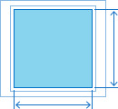
Target width and height (circular glyphs)

| Regular tab bars | Compact tab bars |
| 25x25 pt (75x75 px @3x) | 18x18 pt (54x54 px @3x) |
| 25x25 pt (50x50px @2x) | 18x18 pt (36x36 px @2x) |
Target width and height (square glyphs)
| Regular tab bars | Compact tab bars |
| 23x23 pt (69x69 px @3x) | 17x17 pt (51x51 px @3x) |
| 23x23 pt (46x46 px @2x) | 17x17 pt (34x34 px @2x) |
Target width (wide glyphs)

| Regular tab bars | Compact tab bars |
| 31pt (93px @3x) | 23pt (69px @3x) |
| 31pt (62px @2x) | 23pt (46px @2x) |
Target height (tall glyphs)

| Regular tab bars | Compact tab bars |
| 28pt (84px @3x) | 20pt (60px @3x) |
| 28pt (56px @2x) | 20pt (40px @2x) |
'Human Interface Guidelines' 카테고리의 다른 글
| 애플 휴먼 인터페이스 가이드라인(42) Views -2 Activity Views (0) | 2021.02.19 |
|---|---|
| 애플 휴먼 인터페이스 가이드라인(41) Views -1 Action Sheets (0) | 2021.02.19 |
| 애플 휴먼 인터페이스 가이드라인(38) Bars -4 Status bars (0) | 2021.02.16 |
| 애플 휴먼 인터페이스 가이드라인(37) Bars -3 Sidebars (0) | 2021.02.16 |
| 애플 휴먼 인터페이스 가이드라인(36) Bars -2 Search Bars (0) | 2021.02.16 |


